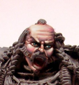
I was asked to write a tutorial about how I painted skin on my drunes.So here is few words about my way of painting skin on example of Muldo, Hammer-Brute from Mierce Miniatures. This is quite large figure – 65 mm to the eyes (which are not visible, but still 😉 ) so there is a lot od space to show my technique. I paint drune skin here, but the same principles apply to painting human skin in general.
Here is the mini airbrushed with basic skin color.
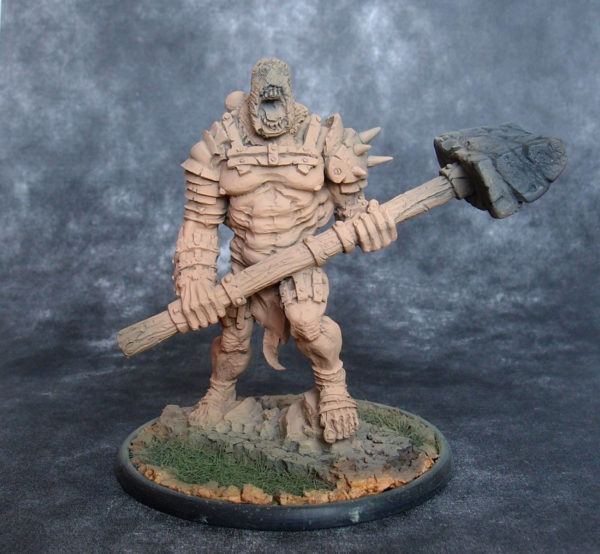
If it was smaller or did not have so much bare skin, I would apply basic skin color with a brush. My basic skin color is Citadel Elf Flesh. Most of available flesh colors (including this one) are in my opinion too orange, so I always add a little of light blue (Vallejo Glacier Blue here). In case of elves or females I add more blue (up to 40% of the skin mix), in case of males, especially barbarians or drunes less (about 20-25%).
Since I airbrushed the mini, I added a little white to the last layer and sprayed the mini from the top to build basic highlights that would help me in painting. All the next steps are made with a brush.
In the next step I apply shadows. My primary color for shadows is 50% mix of Vallejo Royal Purple and Vallejo Cavalry Brown. I gradually add it to the base skin color mix. Here you can see my basic skin color (on the left) and shadows color (on the right). What is between is a mix of those two. The shadow color is really strong (it changes a lot the base skin mix, which is quite light) so I add a very little of it to the first shadow layers.
The 2 keywords for painting skin (or any other miniature painting) are DILUTION and GRADUALLY. I want to make all the color transitions smooth, so I dilute tha paint for shading (and highlighting also) and I gradually add shadow color to the mix for each layer. How many layers do I make? Usually 4-5 are enough. In the end I add a little black to the pure shadow mix and paint darklines along borders of skin areas (in this case near armor plates or pieces of fabric). Below there is how the mini looks after shading. There was no highlighting yet and the muscles on the figure are already nicely emphasized.
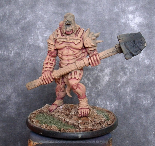
As you can see I also painted the base. Generally I always paint the base first (if I airbrush the miniature, than in the second step). I use rather simple techniques to the base (mostly wash and drybrush) so I want to do this in the beginning not to spoil paintjob of the mini itself by accidentally messing it up withe the base color.
After shading comes time for highlighting. Again I start from my base skin color mix and I gradually add white (Citadel White Scar in this case). Proper dilution of the layers is also important here. Below you can see basic skin color on the left gradually mixed with white towards the right. Of course further highlighting is possible. The most “prominent” parts like knuckles or tip of the nose are painted in almost pure white. I like to achieve high contrast between shadows and highlights. Again I usually apply about 4-5 highlight layers.
The brute’s body is quite harsh and full of muscles, so there are many spots of shadows and highlights. Here is how it looks after applying highlights:
I hope that now the contrast is appropriate and the mini does not look boring. I could paint more layers and “polish” the miniature more, but I think this is enough. It took me about 5 hours to paint the mini to this stage and as I have limited time for painting – I don’t want to spend more on a single figure. I prefer to paint 3 miniatures to a good standard than 1 mini to a better one. It’s all the matter of compromise between available time and the paintjob quality.
As soon as I paint the remaining parts of the miniature, I will show the final results in the next post.
Edit: HERE is the link do the photos of finished miniature.
Any tutorial is useless until you try to practise it yourself. Don’t be affraid to experiment and find the technique that is the best for your uses.
If you want me to explain something or have any suggestions for future tutorials, please write it in comments section.
Cheers!
Idea how to paint Chaos steeds or Drune steeds
Recent news about return of Confrontation miniatures under the new label of Legacy Miniatures reminded me about the tutorial I wrote about painting steeds for drune raiders. Even if it’s nothing new, you may still find it useful if you are looking for ideas how to paint chaos demons or steeds – this method of painting skin may inspire you to do something interesting.
Introduction
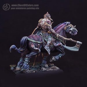
As you can see the model I used was a Drune Raider from Confrontation, but the way I wanted to paint his steed was supposed to make it look demonic and unnatural. I feel that this skinned look with well defined muscles can be perfect for painting Chaos creatures.
When I am painting I often forget to take photos in the meantime, so I didn’t make a full step-by-step documentation.
That this skinned look with well defined muscles can be perfect for painting Chaos creatures.
I still hope that what I prepared gives some impression of how I created the effect that may be inspirations for those of you who wonder how to paint chaos models and their skin.
On the very beginning let me explain that the primer was not white. 😀 Don’t tune your display screens. 😉 It’s the grey spray from Maimeri Idea Spray (in my own palette of colors I would call it ‘ash-colored’).
Let’s start!
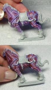
I started painting with thinning VMC 960 “Violet” heavily.
Remembering about shapes of muscles I applied glazes with a brush. This way I became familiar with the shapes of this model and started creating the next moves.
The next color I used was transparent red-brown – VMC 828 “Woodgrain”.
I used it to define the horse’s muscles more boldly… First I outlined the sinews, and then I added direction to them.
To bind the colors and reduce the contrast, I added glazes in both colors where ever I painted sinews. Don’t try to achieve such an effect in one layer – it was creating by applying more than one layer of paint. The more layers the more saturated your colors will be.
Shading
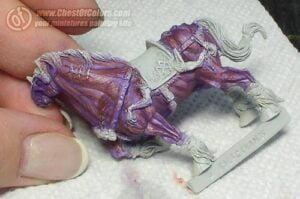
The next step was applying shadows, which made me use black color. I used ink at this stage, because it adds no texture and allows me to manipulate in recesses and build up protruding muscles… With thin lines I painted transitions from light to shadow on the sinews without losing saturation of colors.
I glazed it with Transparent Blue because Vallejo Black color is not black enough for my concept of such sinister moods
Black looked a bit vulgar on the miniature, so I made it a bit milder by adding some violet and red-brown glazes on the borders of colors.
When I was thinking about the model, I wanted something to tone down the warmth of red colors and I decided to add some green. The drune’s tunic seemed to be a good place for this. To bind the colors of the rider and the horse together, I had to add some green to the whole palette, and so I decided about the area around the eyes, and – omitting the neck – head toward highlights of the lower parts. A color less saturated than reds an violets was supposed to imitate the effect of partial shading. But I found that adding VMC 920 “German Uniform” green made the horse look matt and made it bland and nondescript… and so I found another color 😀
“And in the darkness bind them…”
To bind the green with other colors on the horse I used VMC 938 “Transparent Blue” (as the name suggests it’s a transparent blue paint ;)). It’s most visible on the horse’s face, but you can see it also on the legs, where I used it to cover the green – not only on the edges (as it was done in the upper parts) but also glazed the whole green surfaces with it…
The subject is nearly completely covered now 🙂 To make it more complete I can add that I used VMC 907 “Pale Greyblue” (which is an equivalent of the primer I used) on some parts to highlight the top of sinews, and I covered the deepest shadows with black paint. The dullness of the paint made the black even deeper, and I glazed it with “Transparent Blue” because Vallejo Black color is not black enough for my concept of such sinister moods. 😉
Now you know how to paint Chaos creatures!
If you reached this part of the tutorial, you have enough patience for painting with glazes 😀 I hope you will share your own ideas and methods of painting evil and sinister creatures in comments below.
I wish you good luck.
— Ańa
How I painted wings for a Demon Prince of Nurgle
It must have been in 2008 that I painted two commissioned Chaos Demon Princes of Nurgle in that pre-heresy color scheme (white armor with green decorations). At the time everybody used winged Demon Princes for Warhammer 40.000, so these had to have wings, too. So I used wings from Heresy Miniatures B’hakoth model, converted them and painted in a disgusting Nugle way. But this only started the series of questions how I painted these rotting leathery wings. To avoid responding to every question separately, I created this tutorial showing how to paint wings for a Nurgle Demon Prince.
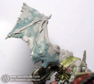
Here’s the first wing. It’s more or less finished, and at this point I decided to take pictures of the process of painting the other wing.
Generally I don’t try to analyze or organize thoughts clouding in my head in any logical way… (otherwise I might decide that if I don’t know where to start, I should not start at all ;-))
I prefer to go all ahead instinctively… to keep my thoughts busy (especially to keep my left hemisphere busy, so that it doesn’t disturb the right one :-P) and to start painting… and to hope the rest will be fine somehow.
What I did first was outlining the shape of the “skin” which remained on the wing.
I think it wasn’t a bad choice because in case anything had been wrong, I still could correct it easily, because this light blue color would be easier to cover than red.
The blue color is probably a mix of P3 Coal Black + P3 Menoth White Highlight / Vallejo MC Ivory 918 (you can use any of the two alternatives).
The remaining surface was painted with Vallejo MC Woodgrain (transparent) 70828.
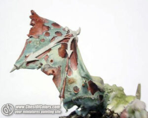
The next photo shows the wing during application of highlights to the skin:
Hmm, I didn’t finish it and I started shading the border between “skin” and “under-skin”.
You can see how unsystematic I was (that proves that the wing was created by Chaos ;-)).
I also added a stich on the “skin”.
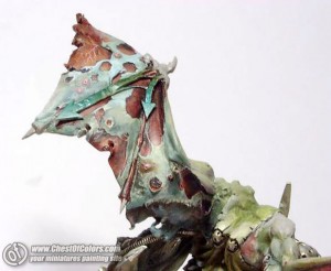
I returned to highlighting the “skin” and modified my concept for colors.
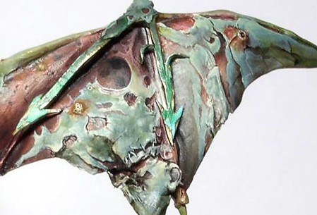
Even the previous photos shows that I added darker decolorations of a green shade (it’s a glaze of P3 Coal Black + Vallejo Smoke Game Ink). The same color as the skin on the final color of the demon’s arms.
I also added some light blue by highlighting P3 Coal Black with white (P3 Morrow White).
That’s more or less what my painting of the demon prince’s wings was like.
Total chaos can sometimes make painting even more enjoyable, and sometimes can only make it more difficult.
This time it was ideologically necessary. 😉
And that’s what the wings looked like in the end (I only painted some chipped paint on the green arrows later.):
If you still have any questions or suggestions – feel free to share them in a comment. I’ll try to check them and leave answers.
Enjoy your painting and share your results!
— Ańa
How to paint skin like Demon Color
In response to all the questions about Demon_Color’s way of painting flesh, we are presenting his own description of how he does it… So let him tell us how to paint skin like he does:
Method one
The skin on the Ogre is painted in two ways. The first way is with use of my favorite lines. I use lines to paint surfaces where are lots of curvatures and raisings on small areas – for example hands and faces.
In the beginning we must choose a raised area, for example a muscle. We have to position front and back of the chosen area. On the front of the area, we choose a place where we will start painting our lines. Now with a fast pull we draw a line from the place we have chosen to the back of the surface. Next we continue drawing other lines right next to previous line but just lighter one. After some practice the lines will look dynamic and will give some dynamism to painted in such way surface. Everything depends on predisposition and skills of the painter. Not everyone will be able to paint this way – you have to love lines to get it right.
We must pay attention because painted surfaces can look like naked muscles – in shorter words – our miniature can look like skinned alive. When I look at my earlier miniatures I see that some of them have tendency to “walk without skin” – and a few times I’ve been pointed out about that.
Method two
To avoid that I use the other method of painting skin – soft transitions. I use it mainly when painting large, flat surfaces. Everything goes just like with blending, but mainly on semicircle surfaces (in the case of Ogre – blade-bone) I use a characteristic line which will mark out the area of the blade-bone.
Colors used
For both methods I use the following colors (Vallejo paints):
- DARK FLESHTONE nr 44 (GW Bestial brown)
- PARASITE BROWN nr 42 (GW Snakebite leather)
- sometimes COBRA LEATHER (but rarely) nr 40
- sometimes SCROFULOUS BROWN (rarely) nr 38 (GW leprous)
- DWARF SKIN nr 41
- PALE FLESH nr 3
- WHITE
How to paint faces – Tutorial
Painting faces is one of the crucial parts in miniature painting hobby. Unfortunately many people give up before even trying to master this skill. This tutorial explains how to paint faces, but in fact it’s much more than that. It also teaches how to use colors for shaping your miniatures, how to create sense of depth with colors, how to make skintones interesting, and how to play with color nuances on your miniatures. To put it shortly: it’s a must-read for every aspiring miniature painter.
Well, with this I believe that the subject of the faces is complete. In this tutorial I address location of lights and shadows, midtones and tones to heighten and to disguise volumes. In addition it’s expanded with color palettes and tones for different surroundings, specially focused to the four seasons.
Palettes
First of all, painting a face is thinking about the palette of colors that im going to use. A very common mistake between painters is to be accustomed to a mixture and to use it for all type of skins. They finish doing monotoneous and little realistic works when they paint faces in particular circustamces. This can be minis under a strong light, bronzed by the sun or when trying to represent figures of different ethnic groups in the same diorama.
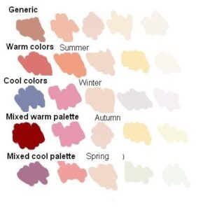
In the picture below it’s possible to observe some palettes that I have created for the occasion. One is a generic palette of brown neutral, very similar to the one I use for base colors, accompanied by other four sets of tones. Two primary pallettes (Warm and Cold) and 2 mixed. The intention is that mixing the palette of generic with the suitable palette of tones we pruned to give the atmosphere that we wish to surround our miniature.
The first palette of tones is the one that we will call generic.
They are the typical flesh colors that have a neutral tone and that we will turn to warm or cold according to our chioice. Andrea’s flesh paint set, basic skintone (VMC) , brown cork, light flesh could be colors of this type.
Later we have the palette of warm colors.
This palette is the ideal to use in a summer atmosphere since the thermal sensation of its colors evokes the summer period. It uses ochre and orange colors for reddish the midtones and brown tones for the zone of shade. Flesh is illuminated as well with a yellowish color that simulates the direct solar illumination.
In the opposite side we have the palette of colds.
This palette would be adapted for a winter typical scene by the temperature of its colors. One is based on pink for midtones and blue or violet for shades. The illumination is made with a greyish color that does not warm up the lights.
So how to paint faces with these palettes?
We can see a compared example of both palettes in this digital painting recreation (miniature was only digitally painted).
The mixed palettes correspond to mixtures between cold and warm colors. Indeed spring and autumn match in their intermediate temperature so we are able to use them indifferently.
The spring palette that I have taken is this:
This composing in its majority by cold colors since my intention is to intone with the intense green color of the leaves at this time. The midtones will be of a pink-orange tone and the shades will go in fucsia. The lights became a little grey applying some greenish tone to the skintone to simulate the dragged pallor of the winter.
Finally the autumn palette, that is the following one:
Composed in its majority by warm colors to intone with the leaves of fall and a cold touch that represents the temperature of the atmosphere. It uses a pink color to simulate the cheeks attacked by autumn cold. The rest of colors: ochre and brown game with the landscape of withered leaves.
Once we selected the color palette to use, there is another aspect to consider. On many occasions the “flesh” colors are colors very saturated to represent the average tones and it’s better to grey them a little to obtain a greater realism. (It is not the case of the miniature that I painted, since the gray tone is present as much in average tones as extreme.)
Here I put an example in a figure by Vincenti for you (that’s realism):
Placing highlights and shadows
In the miniature where the positioning of lights and shades will be explained (Space Marine). I decided to grey all the face and then to heighten the volume giving tones. For the base I used the second base of the Andrea’s flesh paint set who has an intense orange brown color. I toned the color down by adding azur that is approximately the complementary color. Once applied the base it is the moment for adding the lights and the shades. Each face is different but more or less there are certain elements that all have in common. There are zones that always will be in shade and zones which always will be in light and this with some practice you will learn to see it automatically. The light focus is very advisable, for aesthetic reasons, to turn it a little to give more realism and to personalize the face. Its convenient before establishing the incidence of the light to locate the main view of the figure to adequate the light focus to that view.
Once illuminated and shaded the face has a too uniform aspect to seem real (independently of the used color). By applying additional tones we will cause that the face takes realism and in addition we will be able to give depth or to heighten volumes alternating cold colors and warm colors.
Manipulating volume
The theory is that the warm colors tend to heighten a volume, to say it somehow, to push it towards outside. On the contrary the cold colors give to sensation of depth and/or concavity. If we have this in mind its easy applying glazes of cold and warm colors to heighten the reliefs of the figure. Here you have a small example.
Once we learned this it’s necessary to assimilate what we have learned and not to directly associate prominent parts with warm colors and parts sunk with cold colors. The good thing of this technique is that indeed it helps us to emphasize volumes and to make hollows deeper but also allows the opposite. If we have an unwanted volume we can apply the cold tone to disguise a protuberance and the warm tone to minimize a depression.
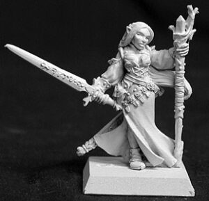
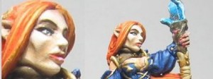
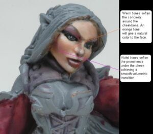
The perfect example is the figure of Lyssete, 28mm of Reaper Miniatures. It is a precious miniature that aside from having the typical Werner Klocke face has a noticeable cheekbone. I’ve selected a few photos so that you can see it for yourselves.
The challenge is in countering the hard gesture that has modeled the figure. In order to obtain it in this case I have used orange colors (my dear German orange) around the cheekbone, that in a normal figure would intone in cold color to mark it. Doing so I have been able to disguise a little the deep hollow that existed.
Later the challenge is in being able to disguise volume that it leaves downwards from cheekbone and that it is so ugly in a feminine face. In this case I need to “sink” the zone but I cannot use blue or green colors since probably they would give a sensation of a beard. I decided to use fucsia color to cool it. This tone does the function to me of cold tone and a similar color with the one of a feminine cheek with slight make up. Therefore using it to make up the eyelids will give me coherence to these tones.
Here you can see the result.
The mini is still unfinished but I believe that the effect can be seen. As always all the questions will be welcome and serve so that everybody understands it better.