As always contest organized by Games Workshop, called Golden Demon, attracts many painters who try to win really nice statues and glory 🙂 Their entries not only can win in different categories, but also the best of all can become Slayer Sword winners – that’s how The Best of Show award is commonly called.
I have asked some of the active members from the Chest of Colors community what do they think about last year’s Slayer Sword winners and their entries. They already have some demons in their collections, so I should better give them the microphone…
Slayer Sword France 2011: Remy Tremblay
Flameon
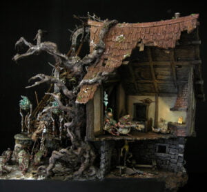
You can watch the scene for a longer time and still you keep finding new elements that you want to give a better look.
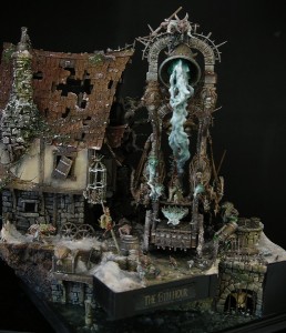
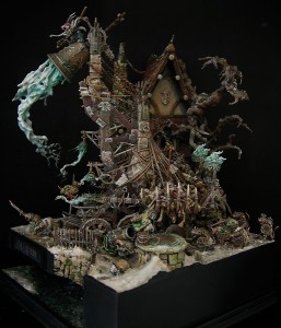
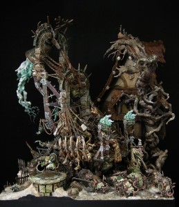
Remy’s work is one of my favorite from last year’s Golden Demons. What I like in this diorama, is that there are so many things happening there. Thanks to that you can watch the scene for a longer time and still you keep finding new elements that you want to give a better look. For example a scared peasant in the sewers under the house, you look at it and then you find a rat who chases him in the tunnel. This makes that the whole diorama very interesting. Also from technical side, everything is painted and modeled at a very decent level. There aren’t many painters who want to paint every model so nice when there is so many of them.
Kacpero
Very good diorama, full of climate, expanded in terms of modeling techniques that were used. Very characteristic, painting approach to color in the execution of Remy Tremblay makes the scene very harmonious. Awarding this type of work with a Slayer Sword shows that in the highest level of miniature modeling world it’s not so much important the accuracy and smoothness of painting but also the idea and the story the author wants to pass.
Przemo
His diorama shows so much! So many things happens in there. There are absolutely no empty areas. Every room, shows a little story. And together they make a great diorama. You can watch it from every side and angle and spend hours on that amazing work. I’d love to see it in real, take it in my hand.
Slawol
There is so much work put into it, both conceptual and artistic. The history is told very clearly, amount of details and the quality of them is staggering. In every corner you can find confirmation of the high level presented by R. Tremblay. Particularly noteworthy are the execution of the water, destroyed roof and a scene that takes place behind bars – a villager trying to escape from the Skaven. From modeling point of view, the diorama is made at the highest level.
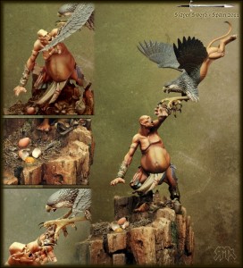
Slayer Sword Spain 2011: Rubén Martínez
Ana
Yet AGAIN a giant won in Spain. I wonder if the Spaniards fought their domestic discount on this product, since this is their flagship proposal for Golden Demon?
Without prejudice to the implementation of craftsmanship, excellent composition, an interesting idea for a scene – yet AGAIN a giant won in Spain. I wonder if the Spaniards got their domestic discount for this product, since this is their flagship proposal for Golden Demon? Fortunately, the scene refreshes the hackneyed subject.
Details are of the highest quality – it seems that he did not take any shortcuts… but what do I know about Spanish painting techniques 😛 Probably, like a typical Spaniard, he did the job in one weekend. 😉
I will not comment about it’s execution, because everyone has his eyes – the only thing I have to reproach is the choice of the model. Booooooring!
Flameon
Ruben has done a nice job but I am missing something more. Both models are very nicely painted but they don’t surprise. There is not enough WOW! From the painting side, the giant is superbly done and the griffon looks underdeveloped. Feathers on the wings blend into one mass because of the lack of any edging with stronger color. On one hand I understand that he wanted it to look natural, but in my opinion it did not pass the exam. I like the eggs, they look like the real thing.
Kacpero
Excellently composed diorama, very good technically (conversion and painting at the highest level). The big downside is the lack of consistency in the style, so the combination of elements that are very realistic with plastic models of GW (striking contrast to the base of feathers and wings of griffin). In my opinion the scene is too uniform in color.
Przemo
Another great work was made by Rubén Martínez – winner of Spanish GD. You can’t talk about meaning it this diorama but there is something else – dynamism. This is the way duel should be done. Expressions, dynamic poses – it looks like a real fight. Base with rocks stones and eggs gives a background of the scene very well.
Slayer Sword US 2011: Vincent Hudon
Ana
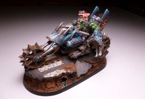
American Chopper Orc is the best proof that the US finally has its champions at the Golden Demons (because so far many of their best painters did not attend to them too often). I wonder what happened with the Americans that they improved so well, because I feel that the intercontinental quality difference finally blurred. Maybe a matter of cooperation and exchange of experiences?
I feel that the intercontinental quality difference finally blurred. Maybe a matter of cooperation and exchange of experiences?
Anyway, it seems that the US winner is better than the UK.
Flameon
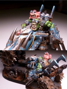
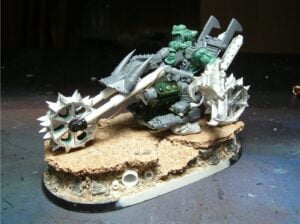
Slayer Sword in the US is a really well painted and converted work. I especially like the humorous topic – wind blowing in the faces of those two, it looks very nice. From the painting and sculpture point of view, I can not reproach this work, it seems to me that it was drawn in this regard nearly to maximum. Only the base is very poor. This kind of bases are done when you need to do a whole unit and not a single motorcycle in a painting competition model.
Kacpero
A really nice, orkish vehicle that fits perfectly in the greenskins atmosphere. The model is enriched with a number of interesting details that distinguish it from other applications of this type (my favorite is the cartoon character of his teeth). Unfortunately, the entry is not as glamorous as most European Slayer Swords.
Loler
Interesting idea and a few nice additions, like for example a fly on orc’s teeth or face expresions on squig and orc. Overall, I think technically it is very good and realistic, but a little uneven such as bike’s armor is interesting, something is happening there and on the contrary the orc’s skin looks boring to me.
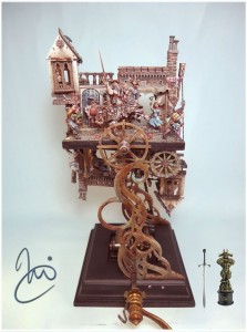
Slayer Sword Germany 2011: Matt Cexwish
Ana
Of all this year’s winners, it was the work of Matt Cexwish that mostly moved the strings of my sensitivity. I am impressed by the climate, and I hope that I will see this work once in real 🙂 Personally, I will arrange a pilgrimage from Poland for this intention.
I congratulate him for the victory, especially that he didn’t go towards more commercial themes. This makes him more a winner in my eyes.
Flameon
Not ideal in terms of sculpture or painting, but the imperfections are compensated by the unusual idea and presentation of the diorama’s story
Matt’s diorama is best known to me from all of which I am writing here, because I had a chance to look at her well during GD in Germany. I think it’s precisely this type of work which should be the Slayer Sword. When you look at it do not you think, “This is a really nice figure, I like the” only “Woooooow, what is it? How did he do it? This is a total madness!” and that should be a reaction to the work that won such contest.
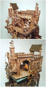
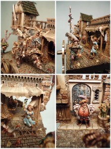
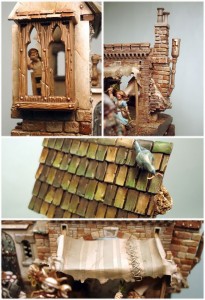
But going into details, I can say that: Matt’s painting is always “so-so” and here is the same but it does not interfere with the perception of this work and it is not the most important element so you can forgive him. Same scene is also quite simple, but in conjunction with the second, which is the opposite of all makes huge impression. Especially when you start to crank, the whole scene starts to rotate and the mechanism of the music box melody begins to play. This is really impressive!
Kacpero
The strength of this diorama is primarily unconventional thinking and creativity of the author. Implementation of certain elements is not ideal in terms of sculpture or painting, but the imperfections are compensated by the unusual idea and presentation of the diorama’s story. This is another to “The 13th Hour” job, proving that the idea and atmosphere you can earn the biggest prizes.
Przemo
Most impressive work for me was the winner of German GD – Matt Cexwish diorama. The whole story, background, meaning nad the construction is so fresh! I love works with meaning, and this one describes so much. It’s meaning is more or less philosophical. The whole idea from creating such a construction is also very impressive. I love fresh ways of doing our hobby, so thanks Matt for creating another path in miniatures painting.
Slawol
This scene I like the most. First place in my ranking goes to Matt’s diorama. In a very original way are presented two versions of events on the diorama and actually the work contains two separate scenes which could well be made independently. Combining them using a rotary mechanism (and also the music box!) is just great. The diorama knocks everything: quality, richness of detail, storytelling and the way in which it has been shown.
Slayer Sword UK 2011: Angelo Di Chello
Flameon
I do not know what motivated the judges, but as for me it is a mistake.
English Slayer Sword totally surprised me (probably the same as other painters), because as far as I can deduce from the photo it is a simple table top. Zero conversion and painting is just weak. In Germany it probably could not even count on Bronze
Kacpero
Nicely painted plastic miniature from Games Workshop ;).
Loler
That I do not understand 🙂 I have seen the miniature live and actually it is good (certainly much better than the pictures, these pictures from the UK are turbo weak), but at the competition there were muuuuch better works. I do not know what motivated the judges, but as for me it is a mistake, the worst sword. Wood’s shaded as if the model was going to be fighting on the tabletop.
Slayer Sword Australia 2011: Kyle Morgan
Flameon
The author effectively captured the individual and unique character of a greenskin boss.
Really bad photos, it is hard to judge.
Kacpero
Next orcish classic. The author effectively captured the individual and unique character of a greenskin boss. Cool conversion and modeling some interesting details.
Loler
Kyle’s ork is very nice, a few interesting snippets (ork’s servo skull, gretchin in the cap), and generally cool climate. The whole composition is as well thought out. Colors are consistent and it all makes good overall effect. I do not like that standard. Blood probably wouldn’t drip down, only sink in or something 🙂
Slayer Sword Italy 2011: Matteo Murelli
Flameon
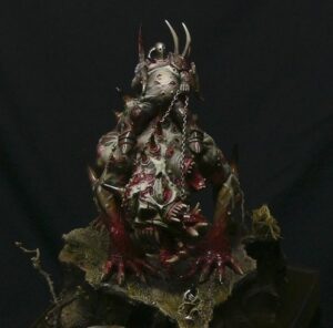
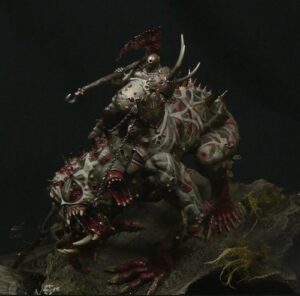
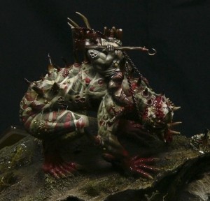
Particularly noteworthy is the performance of the muscles and tendons of a monster and a very realistic blood.
Model from Italy looks very nice. The author had a very good idea for painting the skin of the beast, however, apparently lacked the determination to paint all those leather belts in most places because it looks unrealistic. Besides pictures of the model are made under a strong light coming from above so I am not able to judge how much of the shading on the model is his own work and how much is a natural shade. Because of this, unfortunately I can not honestly evaluate this model but generally makes a very nice impression.
Kacpero
The model is made with typical Italian style, finesse and care. Unfortunately I am not in favor of treatment figures as a base for painting and illustration freehands. For that there is canvas or paper. With such a biased way of judging like this year in Italy, for the next years we will have the most boring and predictable competition next to the British edition of the Golden Demon.
Slawol
I like this model because of the consistency of execution. I also like the theme, which I like very much personally. For this very well have been selected colors, which – thanks to a limited palette (almost monochrome) – creates mood and atmosphere of work. Painting also technically deserves the highest score. Particularly noteworthy is the performance of the muscles and tendons of a monster and a very realistic blood. The whole composition looks very good and entertaining, including a properly designed stand.
Your opinion?
As always your opinion is important, so what do you think about those entries?
Which one do you like best?
Where Golden Demon has the highest standard?
Vote, share your opinion and comment here or at our forum!
Regards,
— sea.man


