Page 2 of 5
Re: Serraphim's W.I.P
Posted: 13 Jul 2011, o 21:34
by Osetin
Very nice but we need more!

Re: Serraphim's W.I.P
Posted: 14 Jul 2011, o 17:43
by Serraphim
Re: Serraphim's W.I.P
Posted: 14 Jul 2011, o 20:06
by Osetin
Re: Serraphim's W.I.P
Posted: 14 Jul 2011, o 23:19
by Maru
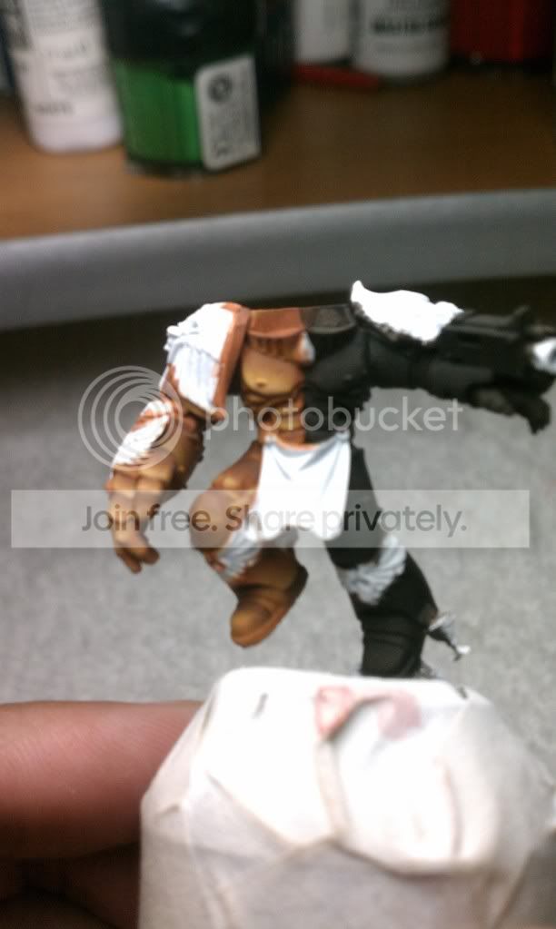
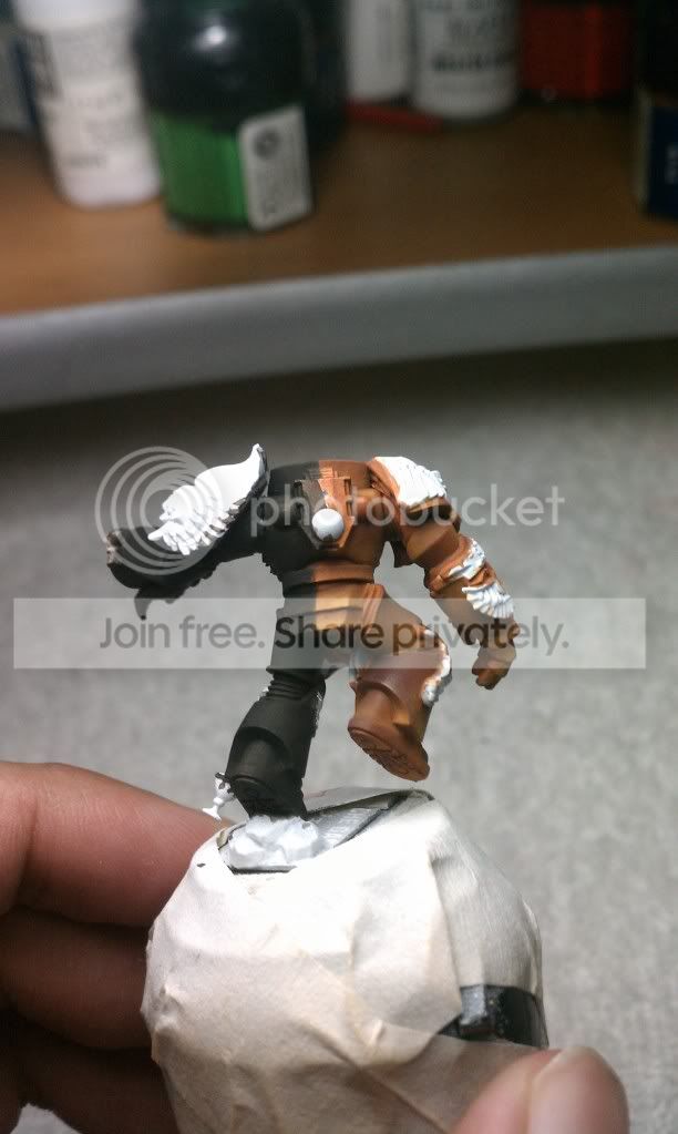
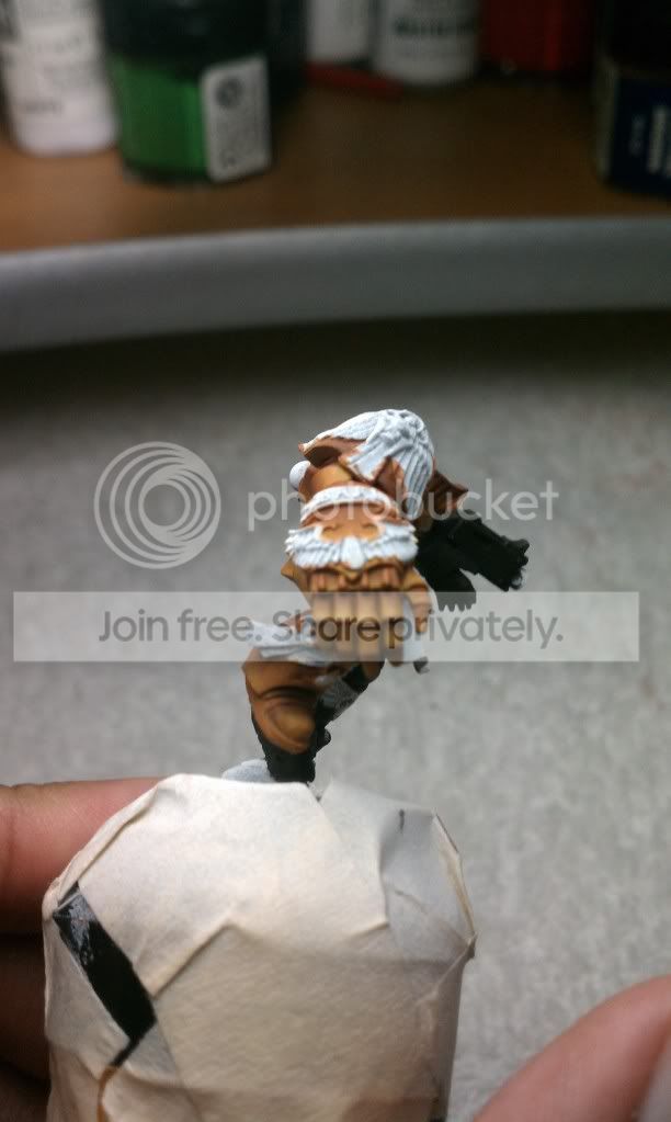
looks caind of brown like bronze not exacly like Gold ..
Re: Serraphim's W.I.P
Posted: 19 Jul 2011, o 14:05
by mahon
gold? where?
are you talking about this brownish color?
Re: Serraphim's W.I.P
Posted: 19 Jul 2011, o 16:21
by Serraphim
What would you suggest to make it look more like gold? I admit looking at it now it looks more bronze
Re: Serraphim's W.I.P
Posted: 19 Jul 2011, o 16:38
by mahon
to me it looks like nice and smooth brown.
to look more like gold it needs more contrast. more highlights

 Click to see full-sized image
Re: Serraphim's W.I.P
Posted: 19 Jul 2011, o 16:52
by Osetin
Re: Serraphim's W.I.P
Posted: 19 Jul 2011, o 17:32
by Serraphim
Thanks for the replies, your comparison photo helps a lot Mahon. So I'm thinking red and yellow (mainly yellow) glazes to try and bring the color up and the redo the highlights. Sound good?
Re: Serraphim's W.I.P
Posted: 19 Jul 2011, o 18:05
by mahon
sounds good. whatever you do - be bold with it. being shy will result in boring miniatures.
and NMM is all about bold contrasts.
always try to find cool reference pics - not only realistic ones, but better impressive ones