Page 2 of 26
Posted: 9 Oct 2006, o 07:38
by Hosea
Keep working and good luck

Posted: 9 Oct 2006, o 09:16
by Nameless
@Stefan - I really hope to get some advice from you and other painting experts. And yes - I'll bring some of my models, so get ready people for commenting and criticizing

Posted: 31 Oct 2006, o 11:20
by Nameless
2 new pics of Naomi. Bit of painting been done, and I sculpted the base. I couldn't get good pics of the base though.
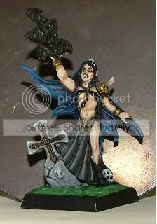 Click to see full-sized image
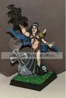 Click to see full-sized image
I started something new - 15mm scale mutant spider called Gargantoid (from Demonworld game). Sculpted by Werner Klocke, btw.
Front and top views:
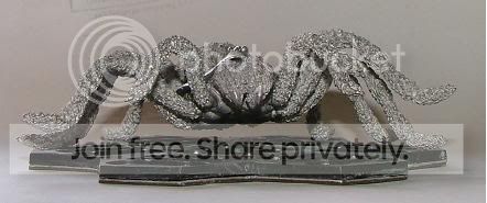 Click to see full-sized image
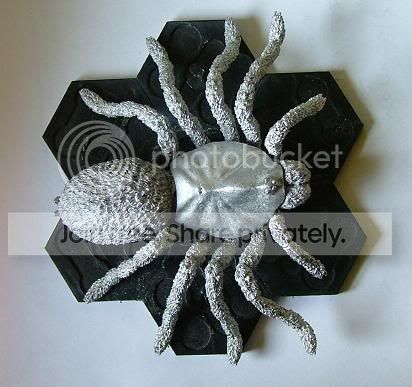 Click to see full-sized image
Oh, the spider will carry a tower full of goblins, so it's not full assembled yet
There are some ugly gaps in the model:
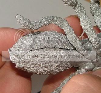 Click to see full-sized image
Size comparison with 28mm mini:
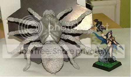 Click to see full-sized image
Posted: 31 Oct 2006, o 12:17
by illusionrip
good begin.....the general eefect is very realistic
and what do you think of a little bit more shadows on skin
Posted: 31 Oct 2006, o 12:52
by przemosz.
As what i can see(but i may be wrong beacouse the pictures are so small) you need to add more water to paint and add more layers. Naomi looks for me dirty , also don't like her skintone(it's not enough vampiric for me), and the face is very strange.The whole mini doesn't have a focus(something that woould catch my eye).
If you want more complex comment please post bigger pictures, these are way to small.
I'm curius how you want to paint that big spider?Fur-drybrush ?
And I'm also waiting when you'll finish display for andrea orc and post some bigger pictures of it.
c y a
Posted: 31 Oct 2006, o 18:51
by Nameless
Big enough, przemosz?

thanks for coments (finally somebody is not afraid to criticize the Master Critic

).
EDIT: gaps filled
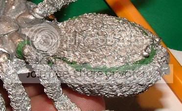 Click to see full-sized image
Posted: 31 Oct 2006, o 20:42
by ToMaZ
I really like the black cloth. It suits this mini by being greyish/fade. Nicely done. The skin is a bit too basic IMO. Try to shade it a bit more. And I hope you are adding some colorwashes to the tombstone :p
Also the blue cloak I don't like. It looks too rough and the transitions are too harsh.
Posted: 31 Oct 2006, o 22:26
by przemosz.
yo!
Yeah now the pic is even to big:D
i'm just trying to break the chains of tabeltop painting so i have to search for all flaws.Many things i wrote about your painting i have to aply in my own painting.
So :
-blue is very bad highlighted it looks dirty
-black/grey -i know that highlithning this colour is very hard but you didnt manage to do it right
-skin as i said is not enough vampiric for me , if i can suggest some mixture(jakob nielsen mix):dawrf flesh mixed with green ink(more ink more greyish tone) than aply shadows using mixture of chestnut and purple ink(you have to try which proportions suit you better)
than again aply first mixture and make sucesive highlights using white up to pure white
-grave looks plastic-use washes
All the things i wrote are IMO and ofcourse i may be wrong(i/m a very weak painter):D
and i wont be mad if you just throw my sugestions to garbage:D
p.s.
damn i cant recognize myself
cheers
Posted: 31 Oct 2006, o 23:15
by Nameless
yeah, yeah, hit poor Nameless right in his head
Thanks guys for comments, I much appreciate them.
Blue colour - I think problems result from a paint, not thinned enough. I have problems to get right consistency and am afraid to water it too much.
Skin - I painted it as human flesh (albeit quite pale skin it is), because I wanted to practice painting skin.
tomb is not finished yet. What washes would you suggest?
Primed model - sorry for pic, I'm too tired to bring another lamp and try to make better
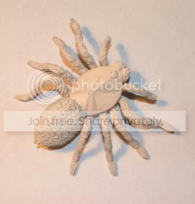 Click to see full-sized image
Posted: 31 Oct 2006, o 23:19
by Demi_morgana
*hits Nameless' head again - this time without any reason*

can't wait to see the srider monstrocity painted

