Page 1 of 1
Grim's Mini's
Posted: 7 Aug 2011, o 18:57
by Grimwolf
Hello everyone, forum noob here. Was invited by Maru on the Infinity forums. Just though I would post up a few of my mini's I've completed over the last year. I hope to be able to improve my painting try to take it to the competition level. Maru suggested you could all help me with that.
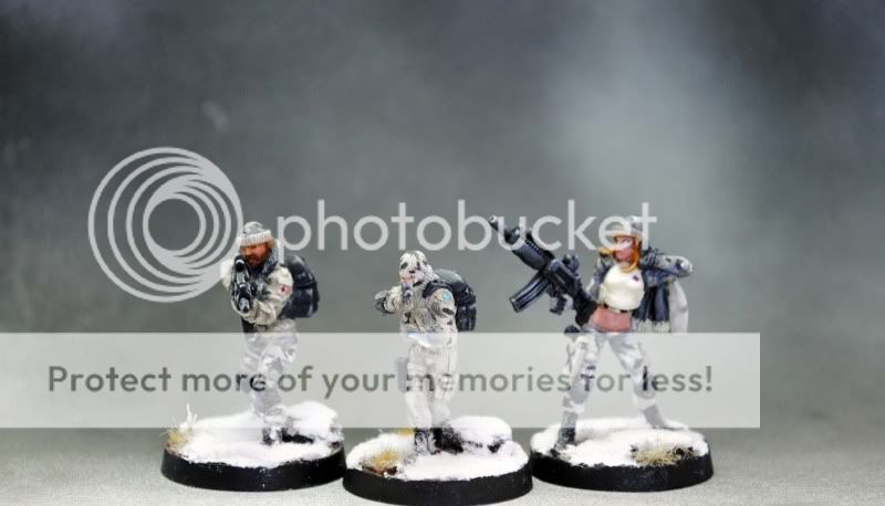
So here is a Confrontation Dwarf, and some Infinity Mini's I have recently finished as well.

I definitely have some room for improvement. Look forward to getting some C & C from you all.
Thanks a bunch,
-Grim
Re: Grim's Mini's
Posted: 7 Aug 2011, o 20:26
by Hellspawn
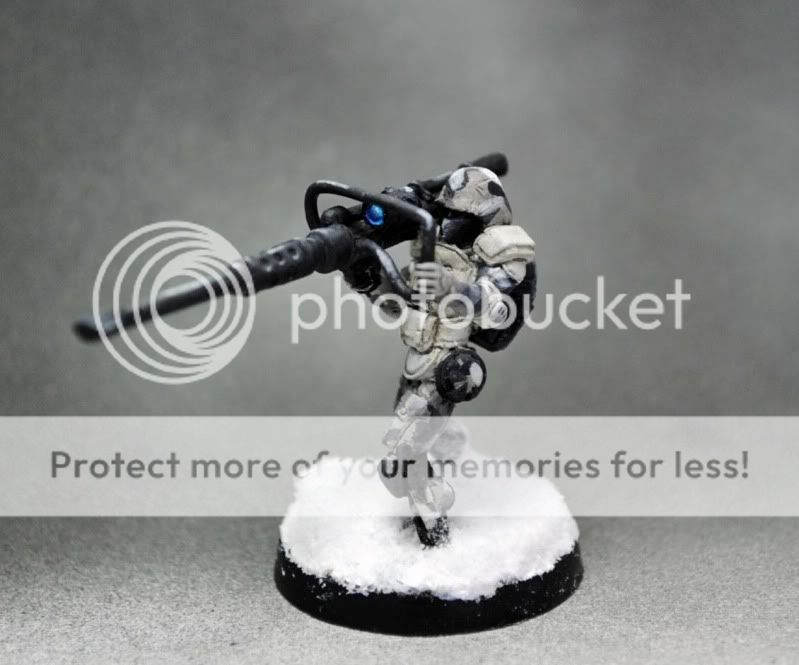
Really like the visual effects of the snow guys/gals, nico work on the lence of the lasgun guy aswell
Re: Grim's Mini's
Posted: 7 Aug 2011, o 21:54
by Maru
well you actualy know my opinion alrdy

but :
thats not a Lasgun - thats Auto canon - portable AA canon actualy
about dwarf - you almoust knew what should be where - almoust - but thing thats lacks is is over all global contrast - it is but not enught end not as "defined" as it should be
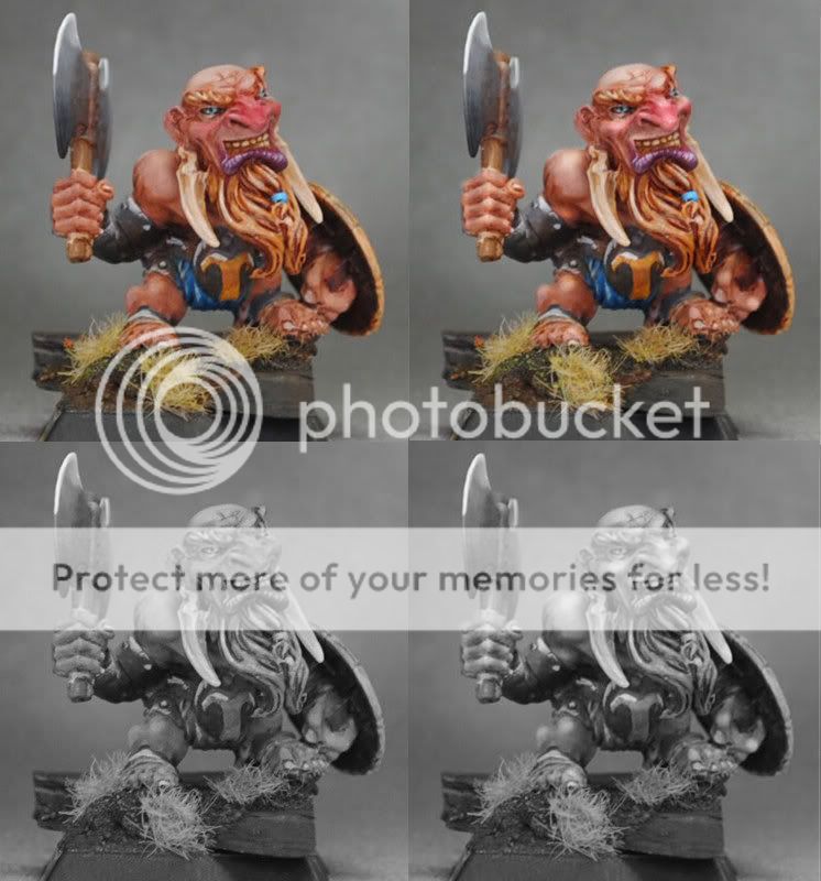
check out - i just incresed contrast on your minis streching it from your "greys" to mine full spectrum
- yes we check minis in B/W to check if contrast is good

Re: Grim's Mini's
Posted: 7 Aug 2011, o 22:03
by Hellspawn
Maru wrote:thats not a Lasgun - thats Auto canon - portable AA canon actualy
Well it's a big gun and looked like a lasgun for me

but even with that I'm pretty sure he understood which figure I was talking about

Re: Grim's Mini's
Posted: 7 Aug 2011, o 22:14
by arctica
You've got a distinct style, and your colour choices work well with the models. I think some more practice in getting the blends smoother with some simple glazes would benefit you greatly and with little effort. You're a neat painter which is in your favour anyway.
With your NMM on your rackham model it needs a bit more contrast on the metals to really make them seem more metal-like as Maru suggested. You have too much base colour on those items and so you need to increase the shading and smoother highlights will give a better end effect.
You're off to a great start anyway, try glazing a bit more, water down the paints and you'll be set on your way !
Re: Grim's Mini's
Posted: 14 Aug 2011, o 16:48
by Grimwolf
Thanks Hellspawn I appreciate it.
@ Maru - That picture is great! I need to learn how to do that. What a great reference. The Black and White helps a lot with knowing where the highlights need to be brought up even more. Cool Cool. Thanks!!
@ Arctica- Thanks for taking the time to write a few words about my work. Thanks for the encouragement and the advice. Ill try to use more glazes in my painting to smooth up the blending.
Thanks a million. I hope to get a WIP of another Soldier of the Plains (Rackham Dwarf) here in the next few days. Maybe you all can help coach me to an 8 on Cmon?
-Grim
Re: Grim's Mini's
Posted: 15 Aug 2011, o 00:38
by Maru
to 8 on CMON ?? - thats easy
you can count on us
but be prepare that large part o "8" end above is good photo
real "9" reqire a lot of work but 8 - that difrent story ^-^
Re: Grim's Mini's
Posted: 15 Aug 2011, o 06:06
by Grimwolf
Maru wrote:to 8 on CMON ?? - thats easy
you can count on us
but be prepare that large part o "8" end above is good photo
real "9" reqire a lot of work but 8 - that difrent story ^-^
I like to take baby steps... start with my first 8 then work my way to the pinnacle of painting that is the ever elusive 9 on CMoN.
Lookin forward to learning from all of you amazingly talented mini painters.