Page 1 of 3
Joseph Bugman WIP
Posted: 16 Jun 2005, o 10:25
by endrem
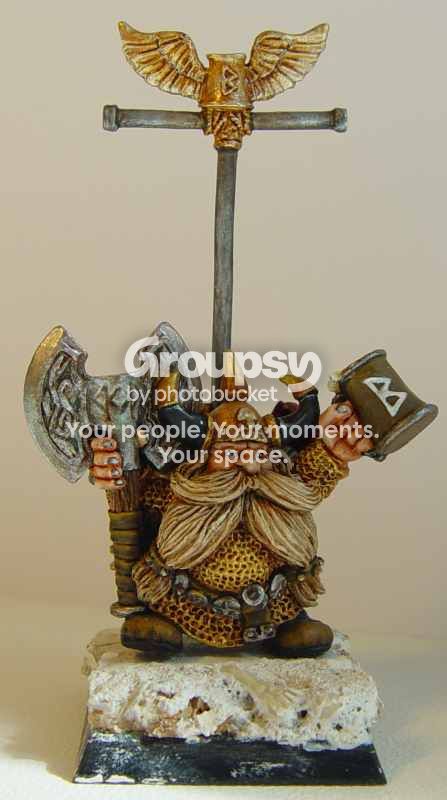
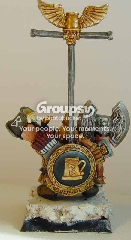
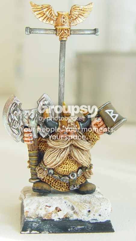
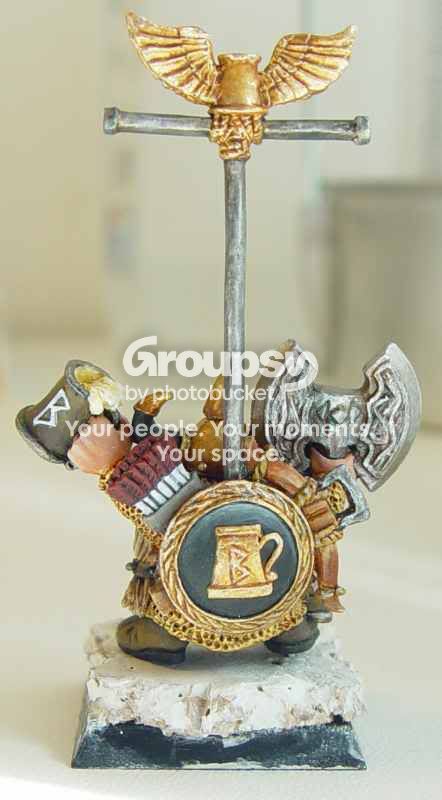
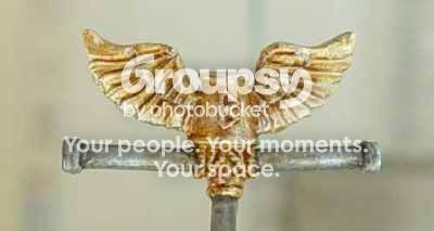
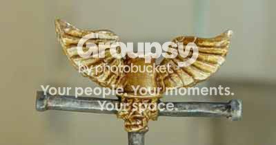
So as promised, here are some pictures of my latest work, an old school Joseph Bugman. There is still a lot to do, base, boots, some washes, horns, corrections here and there... and of course the banner is missing.
Making pictures is not my strongest skill, yet I hope you'll be able to see how he looks like in real life. Probably needless to say, that imho he looks much better in real life...
I link in a brighter and a darker version of the same position, hopefully that helps to judge.
All comments are welcome, be it harsh negative or nice positive

.
 Click to see full-sized image
 Click to see full-sized image
 Click to see full-sized image
 Click to see full-sized image
Links to the darker pics:
https://i3.photobucket.com/albums/y58/stark/bugman7.jpg
https://i3.photobucket.com/albums/y58/stark/bugman8.jpg
I didn't do any photoshop magic on the pictures, these are only wip pics after all...

Posted: 16 Jun 2005, o 10:41
by NAVARRO
I really love the expression on his eyes, its just soooo nice...
Posted: 16 Jun 2005, o 10:49
by mahon
Good job! Makes me think of my Bugman I painted several years ago.... and they are hard to compare.
You got great tones for NMM, and it would need only some more smoothness IMO. I like they way you highlighted the shield. Also the face is very nice - sharp but natural, something which wouldn'ty look bad on a historical mini, too. The samew goes for the beard
Will the gold chainmail get some bright highlights? I think they would be good for the overall effect!
Posted: 16 Jun 2005, o 11:01
by endrem
Ermm, which NMM you mean? Those are all metallics...
I planned to work a bit more on the face, wanted to apply some washes and a bit drunken nose. Then some refining on the chainmail, the shield, the mug and on the wings on the bannerpole. Horns, boots need to be finished. And some other smaller things...
Posted: 16 Jun 2005, o 11:19
by mahon
REALLY

that's why I thought the NMM is so good (
stupid me)

but I still think you could add some silver to make a reflection on the edges of the sleeves, the bottom of the chainmail and the big beer-belly
Posted: 16 Jun 2005, o 12:45
by Skrit
Hey that's looking great! I like it that you made the chainmail gold, it really puts apart the fig!

Posted: 16 Jun 2005, o 14:21
by ToMaZ
Good looking mini!
I like the face, beard and eyes the best. Very good work on that. The shield on the back looks great! especially the gold. In fact the gold helmet and chainmail look good too.
I think that the metallics of the axe could use some more shading but maybe that's what you meant with "some more washes". And the feathers of the arrows could use another highlight IMO.
Overall it looks very nice! very promising
Posted: 16 Jun 2005, o 17:56
by KingUlrikFlamebeard
Wow! I like. the face has a nice deep look and is well painted. His weapons and mug is good. Never seen him done with golden armour, but on that I'll wait and see until the finished look.
So far, very good.
KU
Posted: 18 Jun 2005, o 23:20
by Demi_morgana
nice job! although I'd make it a bit darker it looks very good;
I agree with the rest - the eyes are really eye-catching; they make the mini (almost) alive
Posted: 19 Jun 2005, o 06:47
by Kenneth
Good work, I like your painting style. How much time put into this little guy so far?