Page 5 of 31
Re: Scott Radom's stuff.
Posted: 31 Mar 2010, o 06:42
by ScottRadom
Thanks Hosea! There's bigger pic's of that manhunter at this CMON page...
https://www.coolminiornot.com/244633
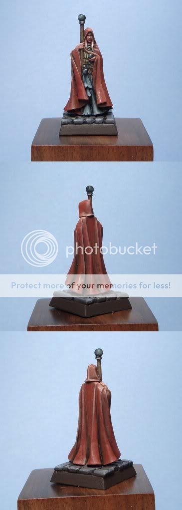
Painted this one this afternoon. Nothin' fancy, it was about 3 or 4 hrs from primer to pics. I am practicing using GW's Orkhide shade as a... uhm... shade in places. Saw it on one of Jessica Rich's mini's and really liked it. So I hade some questions arise from this mini...
-how do you paint spheres to get that gem like effect? I am used to doing the gems with one side mounted so it's more of a 2-d process. How do you guys do it?
-blonde hair? How do you guys like to paint it?
 Click to see full-sized image
https://coolminiornot.com/246833
thanks for looking! bigger pics at the votey link if you like.
Re: Scott Radom's stuff.
Posted: 31 Mar 2010, o 12:18
by Hosea
For the gem effect
- I will use black > then highlight with dark grey on recessive area > then do the same with medium grey > then finally a dot of white > then thined down the gloss varnish and paint over the whole sphere.
For the blonde hair
- I will use a darker brown > then dark bown > then light brown > finally highlight with bleach bone.
Re: Scott Radom's stuff.
Posted: 31 Mar 2010, o 12:20
by mahon
Rincewind: good job on the face and hat. I like the trousers a lot (and they're such a hidden part!) but the cloak and robe don't look. I mean: they're much better than many of your earlier works, but it seems that speed of painting made you drop some quality on the miniature... Some moer contrast there would help, but it's a good work anyway.
The new model is pretty cool, but I am not too fond of the cape - there are some dark shadows, but the rest looks pretty flat and in the same color. So there's no feeling of volume and depth. Regarding spheres - well, they look OK painted in the same way GW paints gems. You need to choose the optimal angle from which the model is supposed to look best and optimize the effect for this angle.
A helpful tip is to take a photo from this angle to see a "flat version" of the model, which can make planning easier.
Re: Scott Radom's stuff.
Posted: 31 Mar 2010, o 16:40
by Hosea
mahon wrote:Rincewind: good job on the face and hat. I like the trousers a lot (and they're such a hidden part!) but the cloak and robe don't look. I mean: they're much better than many of your earlier works, but it seems that speed of painting made you drop some quality on the miniature... Some moer contrast there would help, but it's a good work anyway.
The new model is pretty cool, but I am not too fond of the cape - there are some dark shadows, but the rest looks pretty flat and in the same color. So there's no feeling of volume and depth. Regarding spheres - well, they look OK painted in the same way GW paints gems. You need to choose the optimal angle from which the model is supposed to look best and optimize the effect for this angle.
A helpful tip is to take a photo from this angle to see a "flat version" of the model, which can make planning easier.
"You need to choose the optimal angle from which the model is supposed to look best and optimize the effect for this angle."
Due to my limited English ability, Mahon just said what I wanted to say, but I did not know how to express it, so I skipped it in my last reply, sorry.
Re: Scott Radom's stuff.
Posted: 31 Mar 2010, o 16:44
by ScottRadom
Thank you guys!
Mahon-Appreciate the crit's! While the RBG one was a quicky to sort of test some colour schemes out on the robe the Rincewind one I spent my usual amount of time on. SO that means I still gotta focus on the contrast issues, but I can't blame haste for that one. Just plain ole sloppiness! Much appreciated, I'll keep pushing!
Re: Scott Radom's stuff.
Posted: 31 Mar 2010, o 16:45
by mahon
man, I thought it was me whose English ability is limited, and now you're saying this?

Re: Scott Radom's stuff.
Posted: 10 Apr 2010, o 03:33
by ScottRadom
 Click to see full-sized image
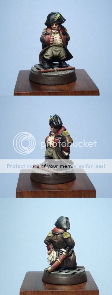
Maybe not gorundbreaking work, but I really like this mini! I'd paint him again for sure. I started painting him in traditional French uniform but thought about changing it up to a 40k look. I'm gonna eBay this bastard and market him as either an IG or chaosy commisar or advisor. On this mini I tried...
-Continuing to experiment with red. LOVE the tip from Jessica Rich about Orkhide Shade for shading red. Need to keep experimenting though
-Used a cool olive green around the eyes and cheek hollows to make him look more sinister and Peter Cushing-esque. That was the goal anyway. So there he is. Fire away if you like!
Re: Scott Radom's stuff.
Posted: 20 Apr 2010, o 22:31
by ScottRadom
https://coolminiornot.com/248469
 Click to see full-sized image
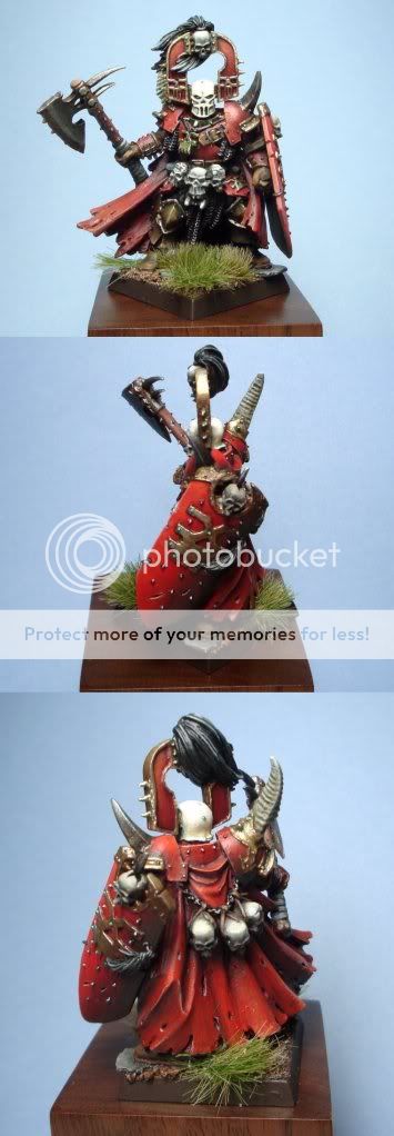
There's bigger pic's at the CMON links if you like. Thanks for the help so far CofC. I think this was a step forward, and I like using the green for shading the red. Course there's still loads of room for improvement. Fire away please!
Re: Scott Radom's stuff.
Posted: 21 Apr 2010, o 06:33
by arctica
That's looking good mate, the reds on the back of the cloak and shield are particularly nice, i think possibly some extra highlights would really push the red. Im not sure if it's the photo or the model but the red on the shield and back cloak seem more rich than his armour especially from the front. At the moment i prefer looking at his back than his front. Looking very good overall.
Re: Scott Radom's stuff.
Posted: 21 Apr 2010, o 08:43
by Marek
Cool stuff. The Napoleon is my favourite, you have created a nice mood in this mini.
The chaos guy could benefit from some highlights on the very edges (of the shield for example).
 Click to see full-sized image
  Click to see full-sized image
  Click to see full-sized image
 Click to see full-sized image