Midnight Lurker's Crap

Post your "Work In Progress" photos here.
Forum rules
Post pictures and discussions regarding works in progress here, please. If you have photos of these works when they're completed, feel free to post them to the right section and feel free to add the link in your post about the work in progress.
Corvus
Guardian of Law & Order
Posts: 2560
Joined: 9 May 2005, o 12:13
Location: Antwerp, Belgium
Contact:

Re: Midnight Lurker's Crap

Post by Corvus »

Thank you for showing your ventures in mini photo land and for trying out my photo backgrounds :)

I had a similar experience with my backdrops: they seem to change the overal hue of the paintjob...

Anyway I think the blue gives the best results.

Great setup you have there by the way. I'm still looking for an affordable setup myself. A small light tent is no problem, eBay is full of these, but lights are more difficult to find and daylight bulbs is something I have never seen around anywhere. Any advice where to get all the stuff<?
Midnight Lurker
Posts: 51
Joined: 5 Mar 2010, o 02:59
Contact:

Re: Midnight Lurker's Crap

Post by Midnight Lurker »

Thanks! :D

Too funny! I was just cruising your blog looking at your set up with envy :mrgreen: and thinking I should try it! Are you still using the foil tent? Are you still liking your results?

My set up is actually pretty simple and cheap. These are the bulbs I use: https://www.amazon.com/Philips-BC60BT15- ... B002KY5NBK I have also heard folks say they get good results with GE Reveal bulbs if those are easier for you to find. Just make sure they are all the same brand/variety/wattage. I got the lamps themselves on clearance from Walmart for less than $10 each! The two on the sides are short little goosenecks similar to this one: https://www.walmart.com/ip/Gooseneck-Des ... k/13285332, and the one on top is a cheap knock-off architect lamp (so it will be able to stretch over the top of the tent.) https://www.walmart.com/ip/Lite-Source-O ... d/13286397

Did you ever figure out a way to correct the hue shift on your backgrounds? I would really like to try for a more polished look to my photos!

laters,
Jen
Image
Corvus
Guardian of Law & Order
Posts: 2560
Joined: 9 May 2005, o 12:13
Location: Antwerp, Belgium
Contact:

Re: Midnight Lurker's Crap

Post by Corvus »

I haven't really been using the foil tent that much. I've made the setup and then took some test pictures, but was quite pleased with that. I'm using one TL light on a swing arm, this produces a white and diffuse light, and it's diffused more by the tin foil. So no need to create a real light tent. I'm considering of making a bigger setup with a second light.

Thank you for the detailed information. I think I will try out the new setup with a second TL light first before I start ordering all the stuff online. Too bad we don't have things like Walmart here :)

The guy who will be giving a miniature photography class at GenCon contacted me last week, he will be using my photo backdrops in his lessons. I will ask him how he deals with the hue differences of each different color.
Midnight Lurker
Posts: 51
Joined: 5 Mar 2010, o 02:59
Contact:

Re: Midnight Lurker's Crap

Post by Midnight Lurker »

Awesome! Please ask him! Thanks!

I had really been hoping to get a nice contrast to Boob Chick's skintones by using a blue cloud background (like the example warrior pic on your blog-- his skintones really POP!) You know... the whole color theory thing... but it just ended up washed out instead. But the plain blue gradient looks okay??? It makes no sense to me.

I might try out a pure black background.... update may follow....
Image
Corvus
Guardian of Law & Order
Posts: 2560
Joined: 9 May 2005, o 12:13
Location: Antwerp, Belgium
Contact:

Re: Midnight Lurker's Crap

Post by Corvus »

I prefer a grey gradient over a blue one because I think it's more neutral. With blue backgrounds I sometimes ended up with a yellow hue on my miniatures.

I only use a black background on figures which are black overall. It's really trial and error, take pictures with different exposures and then select the best ones on your PC.

In this pictures I used a piece of black fleece cloth:
ImageClick to see full-sized image
mahon
Super Villain
Super Villain
Posts: 23961
Joined: 31 Mar 2005, o 23:36
Location: Poznan, Poland
Contact:

Re: Midnight Lurker's Crap

Post by mahon »

Use this simple trick:
- get a piece of white card
- paint half of it black
- put it somewhere in the picture, in a part which will be cropped away anyway
- take the photo
- open the photo in your preferred app (GIMP will easily do)
- click LEVELS
- you will get a slider with "droppers" on its ends
- get a sample of the black paper and use it for the black dropper
- get a sample of the white card and use it for the white dropper

alternatively you can use the blackest part of the miniature and the whitest part of the picture instead of the card, but the idea is similar.

this will adjust your white balance better than any automated method
never trust automatic settings ^^

great painting, pity about the camera problems...

if you need more detailed instructions (eg. for photoshop) - let me know :)

I'm going to prepare a more detailed tutorial about it anyway, but I have no time for this now :(
-- Mahoń

Image

Back in the garage with my bullshit detector
Corvus
Guardian of Law & Order
Posts: 2560
Joined: 9 May 2005, o 12:13
Location: Antwerp, Belgium
Contact:

Re: Midnight Lurker's Crap

Post by Corvus »

so with LEVELS you basically tell photoshop what the hue of your white is and what's black in your picture?
Maru
Camera Expert
Camera Expert
Posts: 3631
Joined: 4 Jun 2005, o 01:22

Re: Midnight Lurker's Crap

Post by Maru »

yes end no
LEVELS are much more compliated , but Droppers yes ther are 3 of them 1 white 1 black 1 grey - if you got all 3 of thous as a markers on the photo - just drop them wich will mean for a program " black with hue of blue = black , White with hue of blue= white, etc .. so it eliminates eny hue changes made by light

but on thous protos of yours ther is a lot of wrong setings like Aperature of 2.8
end they aretotaly over exposed
I have tried to play with my hubby's Digital SLR but I actually get better results from my Kodak!
- thats normal cos "monky camera" got better depth of vision

a baccground color vs whole proto temperature - wel thats old discusuion from optic :) but this efect mey be eliminated by solid setings of WB - in camera

BTW what SLR it is ??


end about Dropers ... worked on Gimp end PS ... you know what - they work better on Gimp ...

EDIT
at fast : with comments (made only With LEVELS + Dropers , without eny addicional "magic" )
ImageClick to see full-sized image
lol WTF .. evrything wrong - over exposure , wrong Hue end WB go to Yellow + red at same time
almoust un fixable .. just wrong photo (mu much errors to fix this without RAW format)
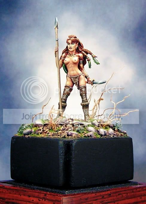
ImageClick to see full-sized image
over exposure , Wrong WB - WB easy to fix Over exposure - not (WB - evrything in Magenta + yellow)
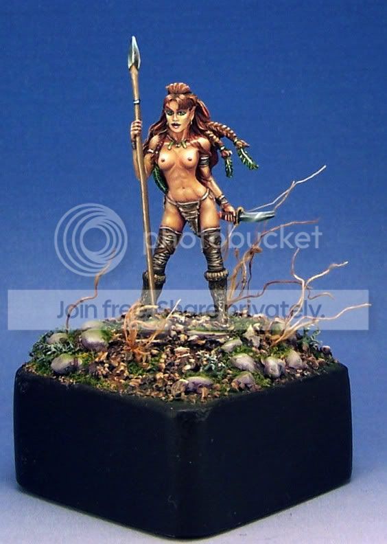
ImageClick to see full-sized image
RED .. to much of it .. end suprisingle to much Green , end over exposure as usual :lol:
"GOOD RACK CAN MAKE A DONKEY ATTACK LION"
https://maru.worldblogcafe.com/
Image
mahon
Super Villain
Super Villain
Posts: 23961
Joined: 31 Mar 2005, o 23:36
Location: Poznan, Poland
Contact:

Re: Midnight Lurker's Crap

Post by mahon »

and overexposed pics are generally difficult to fix. some details will be lost and can't be recovered.
-- Mahoń

Image

Back in the garage with my bullshit detector
Midnight Lurker
Posts: 51
Joined: 5 Mar 2010, o 02:59
Contact:

Re: Midnight Lurker's Crap

Post by Midnight Lurker »

Maru: the DSLR I have access to is called "Cannon EOS Rebel XT". I dug out the user's manual and am going to try one more time to learn how to use the thing. I even have a macro lens, but clueless about how to use that too. :doh:

I downloaded Gimp today, and already have PS CS3. I've got a friend who is a PS wizard who will be giving me a quick and dirty tutorial on Friday. Wish me luck you guys....

I knew I had a lot to learn, but I didn't realize how much! I appreciate the photo examples you put up for me Maru. Thanks a lot! Can any of you tell me if there is a function on either Gimp or PS that will "tell me" that a shot is over exposed? Or is it just a matter of common sense and using your eye to see if things are washed out looking? I can't figure out how you were able to tell my aperture setting was 2.9 just by looking at the jpegs!

Mahon: I know someone who has an index card they shoot with that has the black and white, but also cyan, magenta etc. In your opinion are the extra colors valuable or redundant?

Wow... I am *so* glad I started posting here. I should have come over a long time ago. Y'all have been so helpful. Hey Phil!.... You rock!

Jen
Image
Post Reply