this way you can achieve good contract and it all looks interesting on the miniature
Kingdom Death Man Hunter WIP
Forum rules
Post pictures and discussions regarding works in progress here, please. If you have photos of these works when they're completed, feel free to post them to the right section and feel free to add the link in your post about the work in progress.
Re: Kingdom Death Man Hunter WIP
in places where there's no light (ie. opposite to the direction of light, where the object obscures light) you can even use pure black.
this way you can achieve good contract and it all looks interesting on the miniature
-
ScottRadom
- Posts: 374
- Joined: 9 May 2009, o 07:06
Re: Kingdom Death Man Hunter WIP
Click to see full-sized image
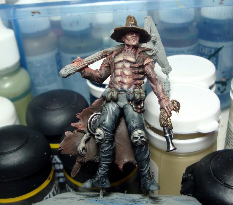
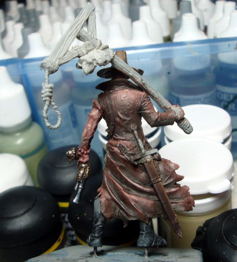
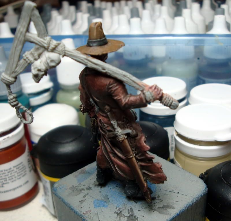
Click to see full-sized imageOkay, so poking around on this guy today. I had given a little thought to putting some real color, birght green and stuff onto the odds and ends on the belt and stuff. I decided that even at the risk of havingthe model all blend in together I'd rather see him look more like the horror movie villain in worn out old dusty style colthes and tuff than go with some colors that might've popped more. Any thoughts on that?
Any way, a little bigger pics this time. The last pic is from the angle I kinda imagine the light coming from, only in a sort of sloppy halo around the mini instead of being sourced from one specific kind of sunny source. Any thoughts on this? I was calling all the bits and pieces done, unless anyone has something to point out? The leather on the scabbard, working, or not? The gun?
Thanks to everyone so far!
Mahon- Went back and added some black to a few areas on the robes. Also used pure black for the deepes shadows underneath things like the pouches and the scabbard. How'd I do? Really appreciate the feedback form CofC so far on this!
Re: Kingdom Death Man Hunter WIP
yeaaaah, that's cool now! I wonder what your own honest opinion is - does it look better or not?
we have only your pictures to base our judgements on, and I think it's a huge improvement!
I also love the skin as it looks now.
I wonder if you're going to use all the tiny holes in his cloak. They could be painted like more subtle variation of scratches people paint on armor, you know, highlighted edges that light falls on. It would make it look old and worn...
But you may feel discouraged by such a task...
we have only your pictures to base our judgements on, and I think it's a huge improvement!
I also love the skin as it looks now.
I wonder if you're going to use all the tiny holes in his cloak. They could be painted like more subtle variation of scratches people paint on armor, you know, highlighted edges that light falls on. It would make it look old and worn...
But you may feel discouraged by such a task...
-
ScottRadom
- Posts: 374
- Joined: 9 May 2009, o 07:06
Re: Kingdom Death Man Hunter WIP
Mahon- Do I honestly think it looks better? Hell yeah! I feel I am realling pushing myself technically on this mini and I think I'm getting better results than I typically do. I am striving for a personal best on this one, and I think it's do-able. I really appreciate the tips and advice I'm getting from here.
Just for a frame of reference, most of my recent stuff scores in the 6.5ish range over on CMON. I know the scores tehre are nothing to set your sail by but for the most part I'd say I get scored pretty fair over there. I think this mini looks quite a bit better than that range, and I think it's from acting on advice from this forum and my other stomping grounds as well. Really appreciate the crits and tips. If people don't give you opinions, crits, tips, all that, how do you get better? Thanks again.
-
Nameless
- The Better Choice

- Posts: 17415
- Joined: 21 Jun 2005, o 17:41
- Location: Silesia, Poland
- Contact:
Re: Kingdom Death Man Hunter WIP
there's a difference in colours (leather cloak) between the first two pics and the last one. which one is closer to real look?
This one will definitely be your best work (though I might have not seen all of your paintjobs
). I love black on trousers.
now, if you really want to push yourself, here's some more nitpicking
I'm not sure about the skin ... something's wrong there for me, but I can't define it at the moment. BTW, is skin finished? I think I'd like to see some reddish brown glazes between deepest shadows and base tone. I feel it could work here, but judge it yourself.
scabbard - try to tie the final highlight on the edge with the rest of it.transition is bit abrupt. Also, you could slightly highlight (diagonally) half of the scabbard part between the top and belt in the middle... I'm not sure if I make myslef clear. There's a hole closer to the bottom, try to highlight the bottom edge just like Mahon suggested doing it for small holes in the cloak.
gun - I like the silver barrel. perhaps that metal stripe around it could be defined better by darklining. wooden handle requires some highlighting IMHO, especially on edges. golden elements are the worst for now. can't see what's going on there and they are pretty flat. try some brown/black washes over them, you'll get some nice shadows. additional darklining might be needed afterwards to separate golden elements from wood, to creat that 3D feel (hey, painters were doing that in before the Avatar movie!). and to finish the job, new highlights would be required after washes.
these are all just remarks/hints/thoughts, if you don't feel they would increase quality - don't use them
This one will definitely be your best work (though I might have not seen all of your paintjobs
now, if you really want to push yourself, here's some more nitpicking
I'm not sure about the skin ... something's wrong there for me, but I can't define it at the moment. BTW, is skin finished? I think I'd like to see some reddish brown glazes between deepest shadows and base tone. I feel it could work here, but judge it yourself.
scabbard - try to tie the final highlight on the edge with the rest of it.transition is bit abrupt. Also, you could slightly highlight (diagonally) half of the scabbard part between the top and belt in the middle... I'm not sure if I make myslef clear. There's a hole closer to the bottom, try to highlight the bottom edge just like Mahon suggested doing it for small holes in the cloak.
gun - I like the silver barrel. perhaps that metal stripe around it could be defined better by darklining. wooden handle requires some highlighting IMHO, especially on edges. golden elements are the worst for now. can't see what's going on there and they are pretty flat. try some brown/black washes over them, you'll get some nice shadows. additional darklining might be needed afterwards to separate golden elements from wood, to creat that 3D feel (hey, painters were doing that in before the Avatar movie!). and to finish the job, new highlights would be required after washes.
these are all just remarks/hints/thoughts, if you don't feel they would increase quality - don't use them
Re: Kingdom Death Man Hunter WIP
This mini turns into something really cool. Congratulations.
I only wonder if the cloak's color and the skin color aren't too similar? Or is it the photo only?
You are for sure heading in the good direction. Keep it up!
I only wonder if the cloak's color and the skin color aren't too similar? Or is it the photo only?
You are for sure heading in the good direction. Keep it up!
*** de gustibus non est disputandum ***
Re: Kingdom Death Man Hunter WIP
on the chest the color is already different enough. the arms still need to be highlighted and glazed to make them look like the torso.
-
Nameless
- The Better Choice

- Posts: 17415
- Joined: 21 Jun 2005, o 17:41
- Location: Silesia, Poland
- Contact:
Re: Kingdom Death Man Hunter WIP
I don't like purple shadows of that intensity. I still think that reddish shadow would work better on this mini and with already painted elements.
highlights - shouldn't they be on "bottom" parts of torso muscle sections?
Re: Kingdom Death Man Hunter WIP
that's why I told to check the holes only. I didn't have enough patience for the skin, so I decided to leave it unfinished and simply wrong...


Click to see full-sized image