Page 2 of 4
Re: Gavvas WIP
Posted: 19 Nov 2012, o 23:41
by Gavva
Re: Gavvas WIP
Posted: 19 Nov 2012, o 23:43
by Nameless
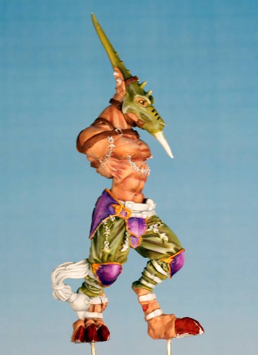
that purple definitely does not belong here, sorry

Re: Gavvas WIP
Posted: 19 Nov 2012, o 23:50
by Gavva
How would you change it? Make it much darker, more blue or red? Or just go with another color. I kinda like the purple but not so much that i wont change it if it makes the rest of the paintjob look bad...
Re: Gavvas WIP
Posted: 19 Nov 2012, o 23:59
by Nameless
it's too strong, too vibrant. You have natural earthy colours (skin, olive clothes...), purple just steals the show, and I don't think you want to have knee-pads as the main element of your work.
you could try to darken it with glazes, but I'm not sure if this would help. new colour - black maybe?
but, it's your mini! if you like it, go with purple
Re: Gavvas WIP
Posted: 20 Nov 2012, o 00:07
by Gavva
Thanks for the reply, it's great to know why you thought the purple didn't fit in. The rest of the model is a pair of armored arms with quite eyecatching armorplates so i was kinda hoping to give them the the same vibrant purple and nice looking NMM gold trims and have them being the focalpoints of the model.
And if it doesn't work out the way i envisioned it i can always change it later.
Thanks for the advice i really appreciate it!
Re: Gavvas WIP
Posted: 20 Nov 2012, o 00:09
by Nameless
sure thing, waiting for new pics
Re: Gavvas WIP
Posted: 20 Nov 2012, o 12:12
by Pandadosmares
the problem is that the purple is stealing the show, that's first thing the eyes are drawn to
Re: Gavvas WIP
Posted: 25 Nov 2012, o 23:29
by Gavva
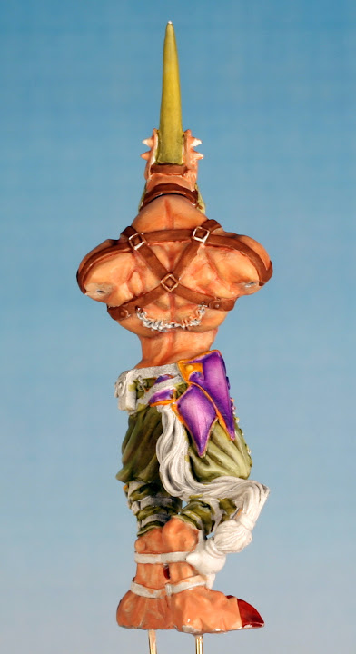
Finally got some time to rework those armorplates.

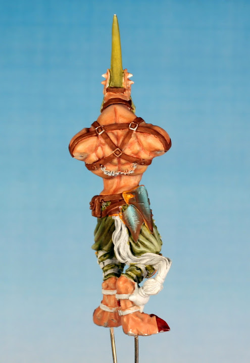
Not as eyecatching, trying for a dirty steel look, might need a bit more grey?
Not sure about the scratches i painted on, doesn't looks right in the photo.

I am having troubles getting the lines thin enough to look good. The paint keeps drying out at the brush tip, not diluted enough? Or do i need a retarder to make this as easy as possible?
Might just redo armor again with more highlight and skip the scratches for this model.
Re: Gavvas WIP
Posted: 26 Nov 2012, o 10:08
by Nameless
much better imho. knee pads and armour protecting loins are just right, some other plates have too much brown on them.
scratches look quite good. the issues you have may be caused by degree of dillution, but also by your brushes - bristle should be capable of taking enough paint
Re: Gavvas WIP
Posted: 27 Nov 2012, o 14:43
by Corvus
Wow this looks so much better!
There's one thing I'd like to see changed and that's the color of the claws on the feet: too much contrast there and it draws the attention to a place where it should not be