Kingdom Death Man Hunter WIP

Post your "Work In Progress" photos here.
Forum rules
Post pictures and discussions regarding works in progress here, please. If you have photos of these works when they're completed, feel free to post them to the right section and feel free to add the link in your post about the work in progress.
ScottRadom
Posts: 374
Joined: 9 May 2009, o 07:06

Re: Kingdom Death Man Hunter WIP

Post by ScottRadom »

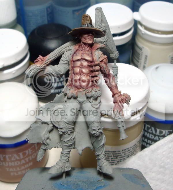
I don't even know if I can call this progress. I am not happy with my work here. I know I had to do something on the veins but I am not sold with what I've got here. I used some of the GW blue and a little green and tried to glaze over the veins till I had a lot of color, then glazed them back down with very dilute Tallarn flesh (The base tone) and I dunno....

I also tried adding a little bit of blue into the shadows around the edge of the torso and the inside of the arm with some dark prussian blue, and I dunno about that either. Then I added a little green across the chest and top abs, and glazed all the flesh with a little purple. Again, not sure about it. Eeek.

But hey, the hat is done!

ImageClick to see full-sized image
Nameless
The Better Choice
The Better Choice
Posts: 17415
Joined: 21 Jun 2005, o 17:41
Location: Silesia, Poland
Contact:

Re: Kingdom Death Man Hunter WIP

Post by Nameless »

I quite like what you've done with veins. skin and hat IMO need further highlighting.
Some additional "painted" scratches on the hat perhaps?
Image
mahon
Super Villain
Super Villain
Posts: 23961
Joined: 31 Mar 2005, o 23:36
Location: Poznan, Poland
Contact:

Re: Kingdom Death Man Hunter WIP

Post by mahon »

And I think you're going in the right direction. I like it much more than the previous version.
How tall is the mini? The photo makes it look like 40-54mm and it can be misleading.
-- Mahoń

Image

Back in the garage with my bullshit detector
Nameless
The Better Choice
The Better Choice
Posts: 17415
Joined: 21 Jun 2005, o 17:41
Location: Silesia, Poland
Contact:

Re: Kingdom Death Man Hunter WIP

Post by Nameless »

Image
mahon
Super Villain
Super Villain
Posts: 23961
Joined: 31 Mar 2005, o 23:36
Location: Poznan, Poland
Contact:

Re: Kingdom Death Man Hunter WIP

Post by mahon »

yeah, quite big. I was afraid that I may be criticizing something that is way too difficult for a human being to paint :oops:
-- Mahoń

Image

Back in the garage with my bullshit detector
ScottRadom
Posts: 374
Joined: 9 May 2009, o 07:06

Re: Kingdom Death Man Hunter WIP

Post by ScottRadom »

Thanks for looking guys. I think I am going to leave the skin for a while and get to the other areas. It'll maybe be easier to see what needs doing on the skin once the rest of the big areas are blocked in. I hope anyway!
mahon
Super Villain
Super Villain
Posts: 23961
Joined: 31 Mar 2005, o 23:36
Location: Poznan, Poland
Contact:

Re: Kingdom Death Man Hunter WIP

Post by mahon »

sure.

some painters finish one part before starting another, while some paint everything simultaneously. I think it's better to have the 'big picture' to see if things work together well or not really...
-- Mahoń

Image

Back in the garage with my bullshit detector
ScottRadom
Posts: 374
Joined: 9 May 2009, o 07:06

Re: Kingdom Death Man Hunter WIP

Post by ScottRadom »

Okay, this is my first attempt in adding more shadow in a mini and highlighting less and shading more further down the mini. Here's what I got....
ImageClick to see full-sized image
I'm using Vallejo Green Grey (or is it Grey Green? I can't remember. the greener one) with about 1:1 black as a base. Then I added more and more black to the mix, shading the hell out of it in the shadow along the inside and outside legs as well as at the base of the legs. Highlighting was done only up to about the mid tone on the bottom half, and up to about 1:1 Green Grey and VMC Buff at the top. Several times during the process I felt the need to glaze with a little diluted GW Black wash to help with the blends and such. A little bit of pure buff was added along the folds and holes in the pants as well. So... too much? Not enough? Thoughts?

I've really appreciated the tips about the skin and the veins. I am going back to them, but I wanted to work on more of the rest of the model to get a better feel for how the skin colours and such are going to interact. Also I agree about highlighting th hat more, but I want to wait until the wood thing gets some paint as my first instinct was to highlight the hat using the colors I plan on using for the wood. I don't think that'd look great next to each other. But maybe I am wrong?

Thanks again gang for the help.
ScottRadom
Posts: 374
Joined: 9 May 2009, o 07:06

Re: Kingdom Death Man Hunter WIP

Post by ScottRadom »

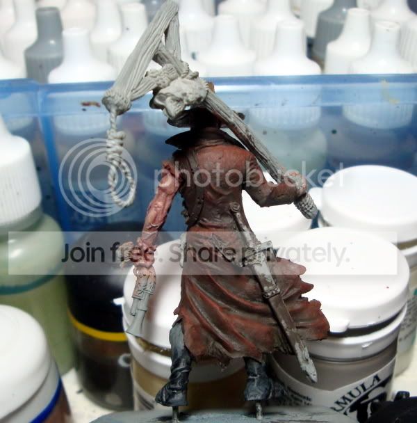
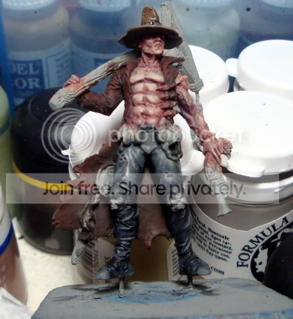
All right, moved on to the jacket to help try and get a better idea where I am going with this mini. I wanted it to be a brown with a reddish look to help differentiate the flesh, which is going to have more blue and purple added. Not done of course on the jacket, but here it is. Basecoated with Cam Black brown. I think that was a mistake and I should have started with a scorched brown maybe. I did the shading with a green, VMC USA Olive Drab which is pretty black green. That's a first for me, and I just wanted to try it out. I like it! I think I'll use that again a bunch. Anyone have any thoughts about the color choices for the jacket, or anything else?
ImageClick to see full-sized image

The pics show that the work on the left calk muscle is pretty rough. That goes on the to fix list. The check list of stuff for sure I need to do...
-More shading/color on the flesh. Pushing towards cool colors. Right?
-Fix up the pants some, esp. the groin and calf.
-More highlights to the hat.

Any opinion on color for the scabbard?

Any thoughts and crits appreciated. Thanks!
Docitalicus

Re: Kingdom Death Man Hunter WIP

Post by Docitalicus »

If I may give a contribution to this discussion, that seems interesting also as a concept.
For sure, it looks like more close to a bloody skin rather than a normal skin.
The "normal" human skin would have in a way more greenish tone...for example, when I start my mix for the flesh, together with the normal skin tone I always add a little of English Uniform which depress a little that reddish tone of the so called skin tone color.
If you wish to parsue the concept of a "film" like Mahon said, maybe a more translucent look would work, by using a greyish stone color for the highlights. As correctly said, nothing to do with contrasts and lights, but only color. Lights and shadows will always be needed regardless of the color. To go more in the direction of a non human, a little more deadly skin, you might add some bluish color, or even going to a bluish pink, while a reddish pink woulf better fit a Vampire.
All these statements of course are just a matter of individual taste and are not really a bible, as you can imagine.
I hope this helps you and sorry if I just dropped into this discussion...
ciuao
Doc

PS, excellent work so far
Post Reply