Page 2 of 3
Posted: 4 Jun 2007, o 11:19
by endrem
I use matt varnish, but sometimes even those appear to be shiny... I have Vallejo Matt Varnish at the moment. Seems to be fine if I'm carful with it.
Posted: 5 Jun 2007, o 11:55
by endrem
Some more WiP pictures:
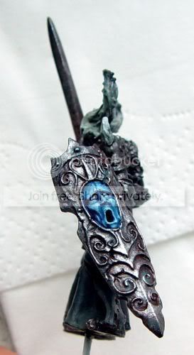 Click to see full-sized image
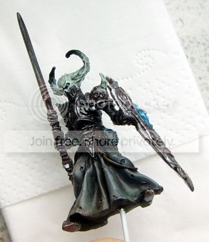 Click to see full-sized image
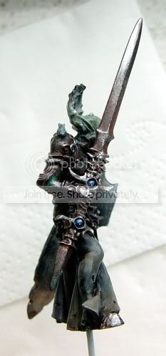 Click to see full-sized image
Not too good pictures, but for WiP it's ok.

There are quite a few places to touch up and the base is missing.
Posted: 5 Jun 2007, o 12:12
by Demi_morgana
hey, I cannot see any greenstuff here so looks like my suggestion works!

Posted: 5 Jun 2007, o 12:31
by endrem
On the right arm, where the lower arm joins the elbow, there is some GS. The tip worked, thanks for it
Posted: 5 Jun 2007, o 15:22
by ToMaZ
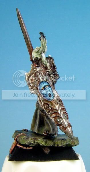
the sword and the shield look cool. The shield looks nicely beaten/used. The face on it could use a bit of glazing though, to make the transitions a bit smoother and maybe use a yellow/orange to make the eyes stand out. Painted like a gem or something.
But maybe all this will make it lean too much to the showcase side

Posted: 5 Jun 2007, o 16:26
by endrem
Good idea, with the orange eyes on the shield, I'll give it a go, thanks
I'll touch up the transitions too.
Almost there
Posted: 6 Jun 2007, o 22:07
by endrem
RE: Almost there
Posted: 6 Jun 2007, o 22:46
by Demi_morgana
still cannot see any greenstuf used

well done!
waiting for the final picture

RE: Almost there
Posted: 7 Jun 2007, o 08:35
by ToMaZ
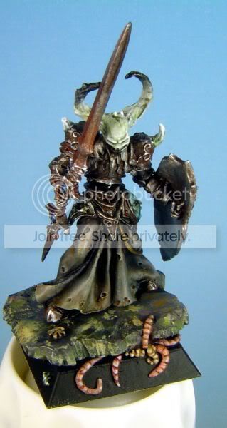
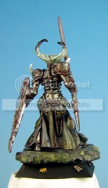
good work overall. But I would try to work some more transitions in the horns. The jump from light to dark is a bit too fast IMO. The chestarmour looks a bit messy to me. Could be the pic though.
I really like the 'fresh' look he has. To me he looks a bit moist, and dirty. Exactly how an undead should look like. And the shield is my favourite part. Really good work on the metallics there.
IIRC this was a gaming miniature right?
RE: Almost there
Posted: 7 Jun 2007, o 09:27
by endrem
Thanks for the comments.
The greenstuff has been painted already, that's why don't see it
As for the chest plate, it is indeed darker than other armour parts, but IRL it doesn't look that bad. I think the darkness is enhanced by the less light fell in there while I made the pics.
I'll try to highlight it further to match the other armor parts. I'll try to touch up the horns, too.
It was meant as a gaming mini, but at the end I have spent way too much time with him
Especially the stupid bugs and maggots took me much more than I wanted.
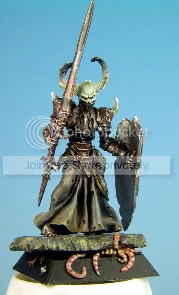 Click to see full-sized image
 Click to see full-sized image
 Click to see full-sized image
 Click to see full-sized image