Bushido
Re: Bushido.
gremlins? ^^

Re: Bushido.
nak Bukakemonos 
hym looks realy smuth a cartoon look like sculpt remid me a disney tous .. or french comixes
wot .. o o realy ..the Cyclops
hym looks realy smuth a cartoon look like sculpt remid me a disney tous .. or french comixes
Re: Bushido.
This is the latest mini(if you can call him that) painted for GCT Studios, for their
game Bushido.
He is Bobata the Bell Ringer, from the Savage Wave faction.
He stands 48mm tall.
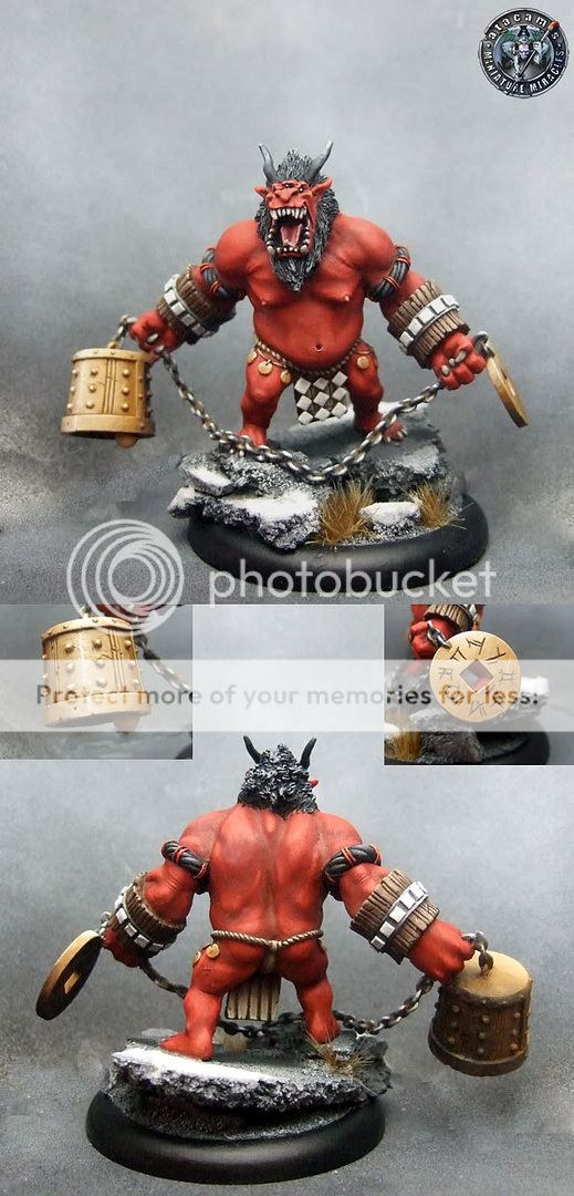
If you like him check out GCT Studios.
https://www.bushido-thegame.com/
If you would care to throw me a vote you can find him on CMON here
Thanks.
game Bushido.
He is Bobata the Bell Ringer, from the Savage Wave faction.
He stands 48mm tall.
If you like him check out GCT Studios.
https://www.bushido-thegame.com/
If you would care to throw me a vote you can find him on CMON here
Thanks.


-
GunjiNoKanrei
Re: Bushido.
The Bushido line gets more and more appealing ... your excellent paintjobs are definitely selling the miniatures
The red skin is very good. At first I was tempted to suggest more contrast - deeper shades and/or brighter highlights - but after studying the pictures it is obvious that there are already strong highlights. That you managed to add quite an amount of white without the red turning pinkish is a testament to your painting skills. I still want to suggest some stronger shading though - I am thinking a dark blue for the deepest shadows and around his nipples (and maybe lips and eyes) to introduce some color there.
Speaking of shading, I feel the bell and disc on his chain would benefit from deeper shading to better transport the illusion of metal.
I just realized that this post is in "New Releases" and not in "Showcase" ... just clicking "unread posts" is to fault here ... not sure if you wanted feedback like this, but since I have written it I won't delete it ... feel free to ignore though ...
Re: Bushido.
All advice, no matter where it is posted is always good, I think.
To be honest in RL he does look different, deeper and more contrasty, the pics do let my work down a bit. I'm not saying he is perfect or there would be 10s on CMON instead of the lousy 7.5 he sits at, never mind. He was very nice to paint, such a clean sculpt, I hardly had to do any prep work at all. Most of the work was at teh joins.
One day I will master the art of photography.
Re: Bushido.
You may not like cmon system and I know that I don't really care about those random scores but to me 7.5 is not lousy and actually seems fair for this mini IMO atacam.
This mini is very meh concept wise, silly weapons are so forced that it ruins the mini, also joints at shoulders seem a bit strange and the multi eyed face is ok but nothing really special and a bit confusing/ blurry. I would not buy it and even if someone offered me one it would be at the very end of my coolmini to paint pile.
Paint wise its a competent painting , all on right places but such huge skin surface painted like that is very boring, I mean no originality there, no extra work with different color nuances on the skin, maybe some bloody scratches or a tattoo... warpaint? anything is really needed to break up the monotony... Its a big mini and IMO it needs something more original on the paintjob to save a average miniature... maybe the silly weapon stone should be painted green marble that casts some lights OSL on the skin.
So in short its not a interesting miniature with some minor concept mistakes and just a competent job does not make it break the 8 mark for me.


 Click to see full-sized image
Re: Bushido.
something perfect for Ana
miniatures painted:
2011 - 83, 2012 - 38, 2013 - 45, 2014 - 56, 2015 - 95, 2016 - 106, 2017 - 22
2011 - 83, 2012 - 38, 2013 - 45, 2014 - 56, 2015 - 95, 2016 - 106, 2017 - 22