A good selection of miniatures. Thanks for sharing

Overall I find most of the pictures a bit too small, making it difficult to see small details or honestly judge your blending.
The Librarian is my favorite. Black and red is a combination full of win. Impressive how you achieved strong highlights using white without the red turning pinkish.
The base is the weakest part here. I assume it is meant for gaming? An easy way to spice it up a bit is to add washes of different colors to selected parts (can't go wrong with GW Terracota and GW Catachan Green). Add the washes not just to the rocks, but to the static grass too, followed by a drybrush with a very light color (on the grass only). This makes the base much more interesting with minimal time investment and effort.
The Imperial Fist is one of the minis were I find the pictures to be too small, but from what I can see you did a good job on a difficult color (yellow). The battle damage looks nice and a reddish brown is the perfect shade for weathered yellow imho. That being said I think you should go even darker with the shading. Add a touch of black (or blue) to your brown and shade the deepest recesses and shadowed areas.
From what I can see I think the blending on the power sword could be smoother, in particular the transition from red to black on the edge of the blade. This is difficult to judge with the small pictures though.
Again the weakest part is the base in my opinion.
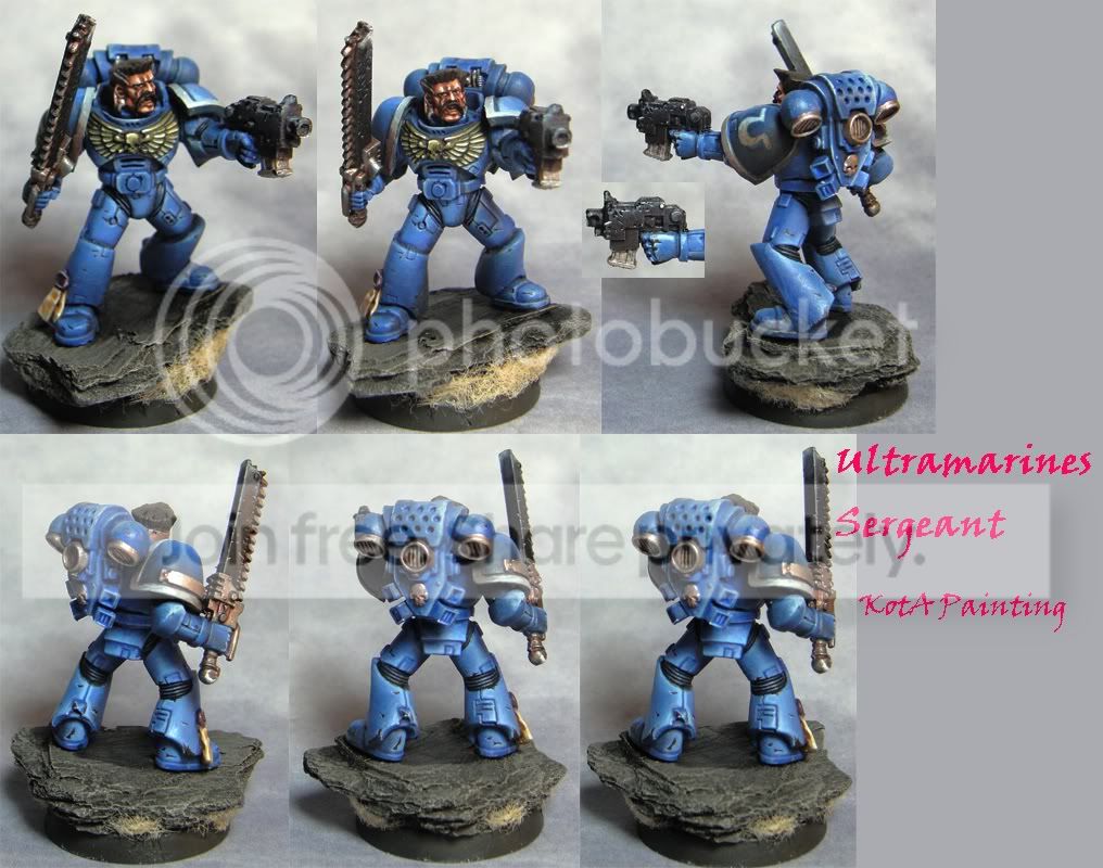
It shows what you said about the Ultramarine Sergeant - the blending on the legs is very good, some other parts look a bit rushed (but by no means bad). A fine miniature, but - again I have to say it - with a very uninspiring base.
The Space Wolf is very nice. Though looking at your Coteaz I think you will agree with me that the NMM gold needs more contrast overall. Go all the way from black to white. Your gradients and fall of the light are spot on, just a bit more contrast is needed to take it all the way.
Ulrik is difficult to judge as the pictures are small and dark. As far as I can say it is a very good miniature (obviously as it won a contest), but you have improved since then. This is especially evident when comparing the yellow to your other Space Wolf or the Imperial Fist. Also your blending has improved - not that is was bad back then, your more recent works are just a bit smoother.
You are off to a good start for your GD 2012 entry. Just continue doing what you are doing ... the blue looks awesome
I can hear you about NMM gold being a tough cookie. I think half of the process is getting the colors right - and you did that. Some might say that your Gold lacks a reddish-brown in the midtones, but I like the fact that you have achieved a rather cold looking gold.
The blending looks good so far. On the right side of the collar (from the viewers perspective) the transition to black looks rather harsh. You might want to soften this out a bit.
Looking forward to the next steps