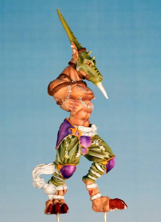
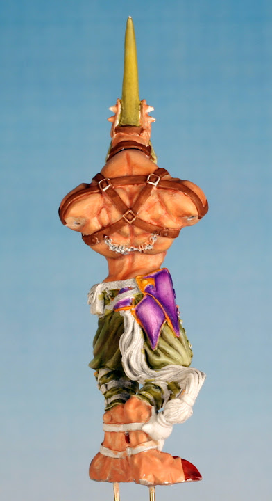
Finally got some time to rework those armorplates.

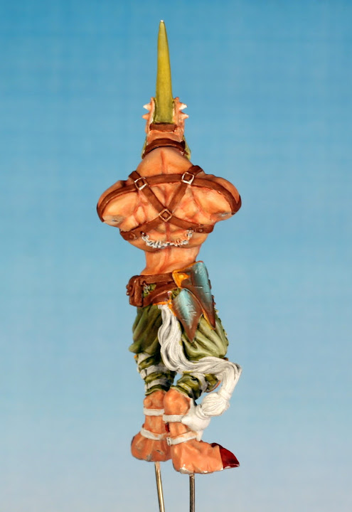
Not as eyecatching, trying for a dirty steel look, might need a bit more grey?
Not sure about the scratches i painted on, doesn't looks right in the photo.

I am having troubles getting the lines thin enough to look good. The paint keeps drying out at the brush tip, not diluted enough? Or do i need a retarder to make this as easy as possible?
Might just redo armor again with more highlight and skip the scratches for this model.