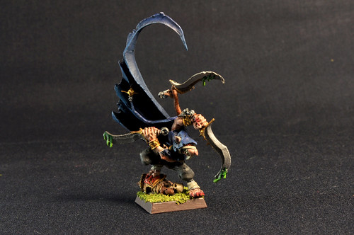
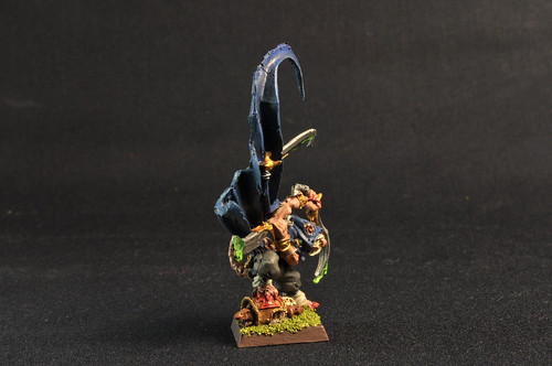
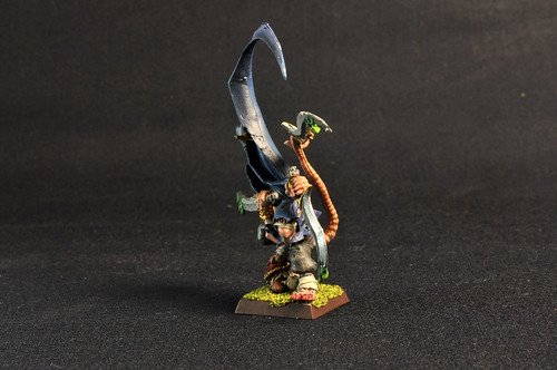
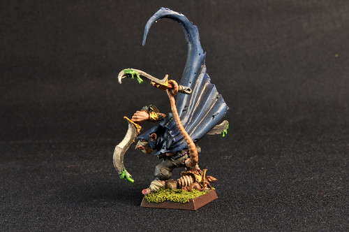
this is my "deathmaster snikch" version,all criticism are welcome.
at last the "coolminiornot" link,please rate me
Deathmaster Snikch di spykeside, su Flickr
http://www.coolminiornot.com/305707
deathmaster snikch
Forum rules
Post pictures and discussions regarding finished models here, please. If you have WIP (work in progress) photos, feel free to post them to the right section and feel free to add the link in your post about the finished work.
deathmaster snikch
Last edited by Hellspawn on 27 May 2012, o 11:24, edited 1 time in total.
Reason: removed non relative picture
Re: deathmaster snikch
ok a feve things :
first - your ME3 signature - is huge - do somthing with it as it hardly count as "banner"
end painting
it is clean
ent this is "regimentlvl"
to improve that - make better photo atm your bigest enemy is light that hit model from right side instide up front
other thing is contrast - much brighter highlights end sharper
end base - as usual
about contrast it is commom that you wil read about this in this forum end usualy it will be "if you think contrast is enught - push it iven more - end then again more - end propably you are now half ther "
http://www.coolminiornot.com/238021?browseid=1722760
look atthis 1 - this is all painted thata not bliks of light
http://www.coolminiornot.com/239555?browseid=1722760
end that is Base + minature - lookminature is actualy painted in a simply end clean way yet very efectivly end if we consider your mini "base colors" this is what you get at the end
Re: deathmaster snikch
Try also to set the white balance before making the photo, all colors seem to be yellow.
From the painting I can only say that I like the blades and toxic fluid on them.
miniatures painted:
2011 - 83, 2012 - 38, 2013 - 45, 2014 - 56, 2015 - 95, 2016 - 106, 2017 - 22
2011 - 83, 2012 - 38, 2013 - 45, 2014 - 56, 2015 - 95, 2016 - 106, 2017 - 22
Re: deathmaster snikch
Thank you all for your advice hoped to be able to put them into practice.
Thanks to all
Thanks to all
Last edited by Hellspawn on 27 May 2012, o 11:25, edited 1 time in total.
Reason: removed non relative picture