First post on CoC

Show us your *finished* works here...
Forum rules
Post pictures and discussions regarding finished models here, please. If you have WIP (work in progress) photos, feel free to post them to the right section and feel free to add the link in your post about the finished work.
Post Reply
Andeng

First post on CoC

Post by Andeng »

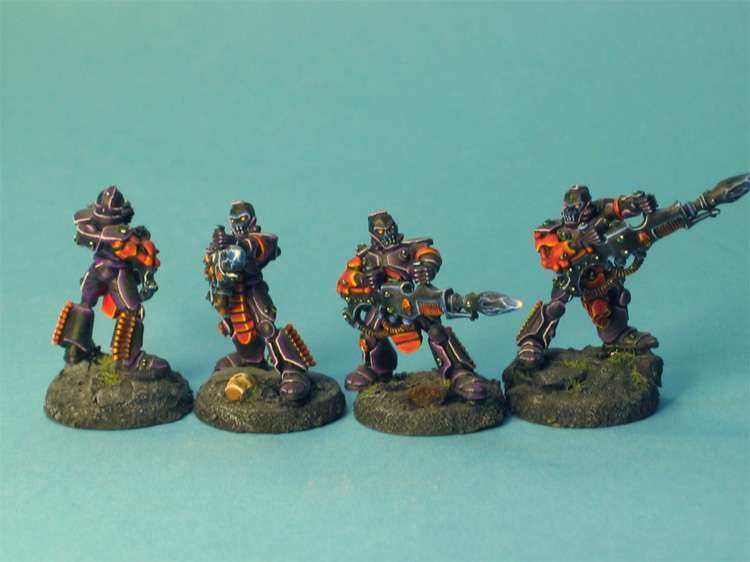
I just hope I can have some comment on those guys. They are o­ne of the units in my Eldar army. Any advise on what to think about in future projects is well come.

ImageClick to see full-sized image

edit:... where did I go wrong?
ToMaZ
Expects too much, too
Posts: 4922
Joined: 10 May 2005, o 19:17
Location: Belgium, Maasmechelen
Contact:

Post by ToMaZ »

Hmmmm no pics...

ImageClick to see full-sized image

That's a bit better I think ;)

Those look pretty sweet. I like the colorscheme and good highlights and edging. Lovely work on the guns too :)

Good job
---ToMaZ---

Try honesty...
Mordred

Post by Mordred »

I copy pasted the links into a new window and they work that way ... maybe try chaning the post and just give the links. they won't appear in the post but it's little trouble to click the links :)

On the pictures themselves : are these part of a larger army? because if they are you have a fantastic table top standard going on. If not, you have a great looking unit. I really dig the colours and how they are working together.

to comment a bit : I'm not a big fan of the extreme white highlights on armours and guns. ( this is personal taste ;) ) I think that if you do use those stark highlights, you should have more graduate layering to get to the white, now it goes black / blue / white. I'm exagerating but that's just to make my point clear :p

great work ! can't wait to see some more of your paintings on these boards.
Andeng

Post by Andeng »

They are a part of a larger army, I?m up to about 1500 points. Still I have not painted all my units in the same color, they are painted like separated projects.
I have always liked "extreme" highlights (like the White Dwarf from the 90th´s)

Still I agree about the black its come up to white a little to quick.

BTW, ToMaZ do you know what I did wrong when I posted the pictures?

Thanks :)
fatgoblin

Post by fatgoblin »

they are pretty cool! I think its great the way you have integrated the entire base into a rock.
Skrit
Needs more explanation
Posts: 10608
Joined: 9 May 2005, o 15:34
Location: The Netherlands, Breda

Post by Skrit »

Great work. At first I thought the purple and orange clashed but after a few looks at them it I kinda like it.
ToMaZ
Expects too much, too
Posts: 4922
Joined: 10 May 2005, o 19:17
Location: Belgium, Maasmechelen
Contact:

Post by ToMaZ »

Andeng wrote:BTW, ToMaZ do you know what I did wrong when I posted the pictures
well, your links weren't right:

This part in the first link: my.php?image=reapers010go.jpg
should be this= img63/9729/reapers010go.jpg. The same goes for the other links.

I think you've copied the wrong link from imageshack...or imageshack provided the wrong link :)
---ToMaZ---

Try honesty...
Post Reply