Following Mahon‘s suggestion I decided to write my first miniature painting tutorial on Chest of Colors website. It is a tutorial about painting NMM gold my way – fast and pleasant.
Contrast is the most important thing in NMM technique.
This technique is intended for using mainly on tabletop quality figures, but with more layers (I used just 7-8 here, including base color and a wash) it can look quite well even on display miniatures.
I will show my technique on terminator librarian shoulder pad. It is hard for me to give precise proportions, as I use mostly my intuition while mixing the colors.
NMM gold – JerzyK’s way
I start with base color (pic. 1) by mixing yellow with little brown and blue, ending in dirty yellow – it is just the way it should be 😉
Then I make wash color by adding more brown to the mix and diluting it to dirty water consistency and apply it to the surface (pic. 2) – it helps to mark various hollows on the surface, which are afterwards emphasized with more precise application of another layer, which is basically wash color with addition of a little black.
The next step is cleaning everyting a little bit with basic color (pic. 3) – washes can sometimes leave messy areas.
I add a little white and blue to the basic color and focus on areas which would collect more light (pic. 4).
From this step I will be creating more and more contrast, which is the most important thing in NMM technique. Another layer of lighter color (more white and blue) is applied within the limits of the first highlight (pic. 5).
Finaly I use almost white highlight with pure white blicks on highest places (pic. 6).
Sometimes before the last step (white and almost-white highlights) I apply blue or green strongly diluted layer if overall color is too yellow.
You can easily evolve my techniqe to get better results, but even now with just a few layers and little time you can achieve effect which look well on gaming miniatures (pic. 7).
And here is another example of a miniature painted in a similar way:
This time: Build me a… tree worthy of Lorien! That’s right we’re going to help mother nature make a treetop house ELVENSTYLE! So if you are interested in a How To Build A Tree tutorial – read on:
Components
We’re going to need:
a piece of a branch…a piece of wood that generally resembles a tree.
a plate of plastic or hard cardboard as a base
a lot “wavy cardboard” (You know, most boxes are made of it)
lots of sand
lots of PVC glue.
at least 1 pack of green stuff
water effect
something that will look like clumps of leaves. I used special modelmaker’s dyed moss.
some plasticard for the actual platforms for the tree house and the pavement.
Some static grass, stones, few pieces of natural branches of trees.
Super glue
some wire/small iron rods
Tree trunk
So starting the fun of Godlike nature construction. We have to have a tree trunk: make a general idea how the tree house is to look like. I decided on a fixed size of the base and I wanted to add a pond to my tree house. So first you make the base. Use strong cardboard and glue a plate of plasticard to it with super glue. The base MUST be strong as we are about to connect the main trunk.
You have it already? Nice! So let’s get down to the actual tree. If you found yourself a satisfactory piece of wood in the forest and planned the general way the diorama is to look like, cut the branch so that it is more or less flat on one end. Place it on the base and make a hole underneath. Than simply nail the branch through the base so that they stick together. I’ve put like 7 nails and poured some superglue around to make sure it’s not going to come apart.
Surrounding terrain
Now we have a stable base lets start building the terrain. I decided to go easy and started to glue flat pieces of the wavy cardboard. Shaping them as I went so that they would make up the general form of the terrain.
As I went higher and higher I added plates of plasticard so that I could have a cobblestone path and a sort of a by-the-pond boulevard. As mentioned I also started making the banks of the pond. I placed the “stones” on the path using superglue to keep them connected to the cardboard.
Once the general shape of the ground level is done, we start the messy part. This involves a lot of sand so make sure you have some kind of a box. To make the terrain look real we will glue the sand to the wavy cardboard with PVC glue. Pour the glue on a side of “ground” parts and simply throw some sand over the glue. It will stick to the glue and after 2-3 layers you should see a nice round hill.
Make sure that it doesn’t stick to the parts that should be sand-free like things that should be a stoned path.
Branches and roots
Notice that the photographs show some other things which we’ve been doing while the PVC was drying. For one you can see more “branches”. This is done so that the actual tree would look like an actual creation of nature’s product of boredom so we’d expect there would be roots and more branches. We connect those by drilling some holes in the main trunk and in the new branches’ bases. We simply glue the previously prepared pieces of natural shaped branches to our tree. you have to drill both the trunk and the new branch and put an iron rod inside to keep the connection strong and stable! you may use some extra green stuff while gluing them together so it will look smoother.
Remember not to glue the new branches before you finish with the staircase and platforms. Just drill and try the new branches so that the general look of the tree will be satisfactory, than go with the construction of the stairs. It will be much easier this way and after you’re done with the stairs and platforms glue the extra branches to the trunk.
Stairs and platforms
Also you may notice the new side bars added to the pond. This is plasticard that will be black and will be the borders of the pond that are not part of the diorama and are considered open waters. Also we started building the platforms and the road itself. The idea is that the paved path will go around the diorama and eventually change into a stairwell of the tree house.
Now you might notice the stairs are going up the trunk. This is done by making small pieces of plasticard. Cut a few strips of plasticard so that they will be of similar width and that you can cut the stairs-steps one at a time and that all will be roughly the same shape. Than make small, but deep cuts in the trunk and glue the steps in. Try to go up the trunk so that this will look somewhat coherent … you can see the cuts on the photo…I used a small modelmakers’ saw to do this. As we go up you might want to start thinking about the platforms themselves. you can see my first platform on the photo below.
Cut any shape you want and attach the platform in the same manner you did with the stair-steps. However, in this case there might be a fairly obvious need to use additional support like a branch and some adapters below the platform level.
Try not to glue the platforms to the trunk and keep them as separate elements. This will make it easier to build them and to construct the whole diorama. The last thing I did in this part was to glue the platforms in after all the painting and gluing of everything else.
Balustrades
This will help the platforms to be stable and will look better. Once you built the stairs and the platforms you might want to add extra edges to the stairs. This rim will add to the overall construction look and will make you believe it’s made by true craftsman and not an overanxious woodcutter who never got to work for IKEA. The photo also shows some important parts on the platforms. A banister, balustrade or a rail around the platforms will add reality to your creation and will look more natural for a high construction structure. I made this using the iron wire and some plasticard. The best way to do this is to simply shape the wire like the area you want to have a banister around. Than make the plasticard pylons and simply make a hole in each and slip them along the wire. Make a small cut in the platform and glue the whole thing together.
Assembly
Now that we’re done with the platforms the hard part is over. Take the platforms out and glue the previously prepared branches to the trunk. If you want even more branches simply drill some extra holes, put an iron rod in them and form a branch from green stuff. Don’t worry about the actual shape because we’re going to cover them with leaves later on.
Painting
Already done with the branches and platforms, are you? Ok… let’s get down to painting. I took the basic black spray available in any construction market/DIY supermarket. Be generous with the spray as the sand will need at least a few layers. Now I went to paint the platforms and stairs. First I painted them with Citadel‘s Bleached Bone , than gave it 2 layers of Citadel‘s Thraka Green wash. In the end I want for two layers of 75%/25% Skull White and Vallejo glaze medium. This last part was airbrushed.
The same treatment was given to all platforms, but the moveable ones were done separately.
Now with the wood itself:
First I gave all the tree parts a drybrush with Citadel‘s Scorched Earth, than a drybrush of Citadel‘s Graveyard Earth and a drybrush of Citadel‘s Bleached Bone. Than a watered down layer of Citadel‘s Devlan Mudwash, a similar one of Citadel‘s Thraka Green wash and again Devlan Mud wash. If you want you can give it a final wash of Thraka Green again and/or light drybrush of Bleached Bone again.
The ground itself was painted with 3 layers of drybrush (Scorched Brown, Bestial Brown, Bleached Bone). The area which was supposed to be underwater parts was given a wash of Thraka Green to give it a muddy/foresty kind of look once the water effect will be applied.
Leaves and final touches
Done? Ok… time to make our tree a proper summer/fall tree: I used special modelmaker’s moss to mimic the leaves on the branches. This can be bought in most proper model shops. I simply used strong PVC glue to glue those to the branches in large mixed clumps and than added some super glue into the insides of those clumps to make the connections stronger.
Now the only thing left is the grass on the ground and the water effect. Some PVC glues are better for watter effect than the actual Citadel‘s water effect itself. Pour this into the prepared ‘pond’ and voila!
See us in Lorien!
You can invite the Ringbearer and his friends once Ian McKellen has ‘fallen into darkness’ in Moria.
So here’s a simple tutorial on how to make movement trays. It’s the most basic way to make a tray for both normal and magnetic bases for minis, but it can add a lot to the visual impact the miniatures make.
What we need to make a movement tray
Here’s what we shall need:
a plate of thin steel (less than a milimiter will do but as long as you can cut it with scissors it’s fine)
a few pieces of balsa wood
some sand
super glue / PVC glue(any gloue for wood will do)
paints and some static grass
How to make movement trays
Cutting the movement tray
First: Let’s cut us a base for our tray! You must decide what kind of a tray you need. For example 3 ranks of 10 Games Workshop normal infantry is 10x20mm of width and 3×20 in depth. This will be the space inside the tray so it’s better to make it a little bit bigger.
For the mentioned example: 10x20mm is 200mm width and 60 mm depth. I usually add 15 to 20mm for to both length and width so that there will be more space in the tray and the unit will not be pushed tightly together. This is important for some units of minis can’t be placed in base to base for a number of reasons.
Also there must be some extra space for the side bars. Once you’ve decided how big must the base be, draw it on the piece of steel and cut it with scissors.
Making sides for our movement tray
Now we have our base for the tray. Cut the balsa wood so that you will have pairs of side bars. You might want to make 4 sides or 3 and leave the back of the tray open. I usually make 4 so the unit will not fall out while being moved. Glue them to the steel with the super glue. Hold it while the glue dries and make sure the side bars go well with the edges of the steel plate.
Adding texture
So here we have something that looks like a movement tray. Let’s make it presentable. Take the PVC glue and put it on the outer sides of the sidebars leaving the interior side and the underside (obviously) of the tray clean of glue. Once you applied the glue to one side of the tray throw some sand onto the tray’s side. The glue will catch the sand. Try to remove any sand that sticks to the bottom or the internal part of the tray. Try to do one side at a time.
Let the tray dry off again and one more time CHECK IF THERE IS NO EXCESS SAND INSIDE THE TRAY! CLEAN IT WITH A KNIFE (or some other tool) while the glue is still wet.
Painting the movement tray
Once the tray is dry paint it black with a base coat of black spray and now drybrush the sides of the tray with the colours of choice (for a typical summer tray I use Scorched Earth,Bestial Brown and Bleached Bone of the Games Workshop Citadel paints.)
Now that this is done take the PVC glue again and make a few dots of it along the sides and throw some static grass on the dots of PVC.
Done!
And voila! The movement tray is ready! Making it probably takes less time than it takes to read this text. 😀
Here’s an example what a unit of miniatures can look on such a movement tray. The tray looks OK, don’t you think?
What would you say if I told you all of the horses in the photo below were painted with dry pigments. No, I don’t mean add a medium to turn the dry pigment into oil or acrylic paint. I mean honest to goodness application of dry pigments. If you want to learn how to paint with dry pigments, read on.
You probably think I’m nuts or the technique would be more trouble than it’s worth – or that it would wipe out detail. You could probably come up with lots of reasons not to try it.
But here you are reading this article. 😀
While I paint miniatures and various historical figures, I also paint model horses. This is a huge hobby but very few people know about it. It is very similar to the miniatures hobby, the only thing different is the focus of the subject – to create the most realistic and accurate to real life horse as possible.
It was in the model horse hobby that I learned this technique and I’d like to share it with you.
How to paint with dry pigments: Principle
The general idea is very simple. Pigments and pastels are translucent tints – meaning they are not completely opaque. You build from light to dark and slowly work toward the color you want to achieve. The top layer’s color is affected by all the layers below it.
Pigments and pastels are translucent tints – meaning they are not completely opaque. You build from light to dark and slowly work toward the color you want to achieve.Starting with a white base, you select a light color and literally stain your subject with a brush or applicator and slight pressure. When you have colored the desired surface, you seal the pigment or pastel with matte sealer. Once the sealer dries, you do it all over again. The color you end up with simply depends on where you stop.
Lighter colors, of course, take less layers. Darker colors, all the way to a rich black with blue and brown undertones can take several. Pigments are pure color, they have no binder so typically take less layers than pastels. While I use both depending on the effect I want, I prefer pigments because of the richer color and better coverage.
Before we begin, allow me to list what you may need, or a least need to know about.
Supplies
Pastels
Pastels
I use both pigments and pastels depending on the desired effect I want to achieve. For pastels you need to purchase a high quality brand. Pastels are colored pigment and a binder, so they keep their stick shape. The binder does not have any color. The cheaper pastels have more binder and less pigment, therefore it takes more to achieve a desired color. The higher quality brand names such as Rembrandt, Sennlier, Unison, etc. have more pigments and less binders, so these are the ones you should focus on.
Pigments
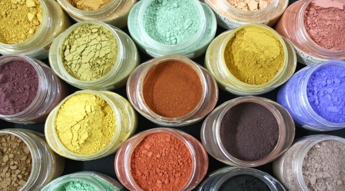
Pigments
I use exclusively Earth Pigments. There are several companies that make pigments, including many for the miniature world for use in weathering. There are also pigments sold by art supply retailers such as Dick Blick that sell powdered pigments made for the oil painter to make their own oil paints. I would like to caution the reader about these. Please check the labels! The pigments for oil paints can contain ingredients that are toxic – cadmium for Cadmium Blue for example, is toxic. If you have children and/or pets, be aware that pigment dust will get EVERYWHERE. There is really no way to control it no matter how careful you are. So know what is in your supplies.
I use Earth Pigments because they have high quality colors, they have a UV rating, their jars are inexpensive and for what we are doing this small amount will literally last years, and best of all they are NON-TOXIC. Yay! Now, they do have a warning not to breathe in the dust, so it’s a good idea to have a mask, especially if you’re sensitive to things like this. But as a whole, Earth Pigments have a lot of fantastic things going for them.
For those of you in Europe, I have a link (I need to dig it up) for a company that is sorta like Earth Pigments “sister” site, where you can get the same thing. I believe they are in France.
Pan pastels
Pan pastels
Like regular pastels, pan pastels are pigment mixed with a binder. But these are pressed into a small pan – very much like a make up compact – so the binders are far less than regular stick pastels. They have fantastic color and go on smooth. Once again they are easily available and not that expensive. I like using the Grays Set of 5 from Dick Blick. But they come in a huge variety of colors, tints and shades, so if you want to get others, go right ahead! These little pans actually screw together to form a stack, so everything stays neat and tidy and they are easy to store.
Pearl Ex Metallic Pigments
Pearl Ex metallic pigments
Not required for the first couple of projects but trust me, if you don’t get them you’ll soon wish you had. These are fantastic for armor and for horses you add just a touch to get the nice sheen of a healthy coat. I have the Series 1 12 Color Set with Free Book except for the neon violet color, all of the other colors work perfectly for armor, metal items, and natural horse colors. But honestly, if I had the money to get all 32 colors, I would! With these comes one caveat….
Colour Shapers
Colour shapers
if you get the Pearl Ex metallic pigments you really need to get the colour shapers. While I want to demonstrate and explain the products I use, I don’t want to say YOU MUST BUY THIS. But these two items go hand in hand and my experience with the generic brands has been poor, so these are the ones I strongly encourage you to get.
I tried applying with a brush and POOF glittery dust explosion everywhere! I tried mixing them with the pigment powder but it was either ineffective or I still had glittery dust everywhere.When I first started using the Pearl Ex, I did not have these and I absolutely hated the pigment. I tried applying with a brush and POOF glittery dust explosion everywhere! I tried mixing them with the pigment powder but it was either ineffective or I still had glittery dust everywhere. These things were so hard to control and to apply where I wanted that I just about threw them in the trash. I’m glad I didn’t.
Out of sheer luck I found the Colour Shapers on Dick Blick and decided to try them. They worked nicely, they are a non-porous rubber so you can use them for paint or glue and just wipe them off afterward. Stuff doesn’t stick to them. In desperation, I tried them to apply the Pearl Ex. It worked like a charm! Now I have almost complete control of application and can apply them onto even the smallest piece of armor. Or I can apply metallic pigment to a large muscle on the horse to get that realistic sheen and not worry about it flying into areas where I don’t need it.
Colour Shapers just came out with a Mini Set that is perfect for our jobs. I purchased the Firm set then went back and purchased the extra firm set (Clay Shapers). I use them both depending on the job at hand. Whichever one you get depends on your style but you will really love these when it comes time to apply the metallics. Trust me on this one! You’re gonna want the Mini set Size 0.
Primer
Primer
Another must have. You will need white at the very least. I prep my horses then apply gray primer because the contrast on the larger scale helps me see anything I missed. (When working on miniatures, I only use white because I don’t want the added layers.) Then I cover the model in white primer.
My favorite brand is Tamiya Fine Surface Primer, both white and gray but at the time of this writing, Tamiya aerosol cans of any sort are not allowed in the U.S. Due to labeling issues. My second choice (and it’s not far behind Tamiya in quality), Is Vallejo White and Vallejo Gray aerosol primers, in fact, I may stick with it even if Tamiya comes back. I tested it first and while it’s a bit too easy to over apply and get it to run, it applies nicely and does not cover fine detail.
Basically you want a high quality white primer that has enough “tooth” for the pigments to stick to but not too much or there will be difficulties with grain down the road. No matter what brand, you MUST prime white as the last step. In order to properly apply pigments and pastels, you must have a white base coat to start.
Matte Sealer
Matte sealer
I use Testors Dull Cote because it is very matte and is non-yellowing. Plus, it provides the right amount of tooth. If your preference is more towards glossy figures, you can use gloss sealer but be aware gloss has less tooth and it will be more difficult to apply the pigment.
Nylon Brushes
The sealer I use is Testors Dull Cote. It’s an acrylic lacquer I believe. Many figure and mini painters use it, especially if they game with their minis. I know folks who don’t game are moving away from sealer because there is too great of a chance of that sealer doing strange things and ruining their hard work. This is why I always spray a test model first, no matter how many times I’ve used that can of sealer.
Certain sealers can react with the primer even if you have several layers in between.I use the same sealer for all of it, paint, pigment, pastels. The type of sealer you use is entirely up to you and if you have a brand preference. But also be aware that certain sealers can react with the primer even if you have several layers in between. That happened to a friend of mine. She started using Tamiya primer, painted a horse using the exact same technique I just described, but when she applied Krylon clear sealer, it started to bubble and everything down to the primer just flaked off. We ended up contacting Tamiya USA and while they had never heard of this happening before, they said it sounded like the Krylon sealer and their primer were not compatible. Anyway, she went back to Testors and everything has been just fine ever since.
I even use the Dull Cote on the metallics. Yes, it dulls them down just a little but I can usually get three layers of spraying Dull Cote on the mini before it dulls the metallics completely.
Nylon brushes
For applying pigments and pastels you do NOT want to use your good paint brushes. Now is the time for the cheap nylon that can stand up to anything you throw at them. Applying this stuff is hard on brushes and you need the kind that is not too soft or you will hit the brush ferrule against the mini. So get the white nylon brushes that are on sale at Walmart or Michaels for next to nothing. The assorted shapes such as the filbert, flat shader and angled shader also come in handy.
Bead Jars
Bead jars
The stackable type come in very handy for mixing pigments and using with pastel sticks. If you take a jar and a pastel stick, hold the stick over the jar and drag the stick against the edge moving inside out, it will grind the stick into powder and the powder just falls right into the jar….for the most part.
Other Supplies
Other supplies
Various grits (180 to as high as you can find them) sanding sponges. Do not use sandpaper! Pointed cotton swabs from the make up aisle at Walmart or Walgreens, etc. the cheapies are just as important as the expensive ones, Tamiya pointed cotton swabs, Canned Air – the same stuff you use for electronics. Colored Pencils – such as Derwent (not water color), Black Charcoal Pencil, White Charcoal Pencil, Brush on Gloss, Gesso (or white brush-on primer), and a Carbide Scraper are all very handy. Don’t put your acrylics and brushes away just yet! You’ll still need those.
Painting: How to apply dry pigments and pastels
I have a Work In Progress thread going on CMON and I used a knight’s cloak as an example of how to apply dry pigments. So I’m going to draw on those photos for the purposes of this article. The character in question is Pegaso‘s Roaming Knight and I had started painting the cloak with acrylics, then decided to apply pigments instead and used the example of why we must start with a white base when using pigments and pastels.
So, our knight is starting of with a standard acrylic layer of paint, a sort of olive drab – think of the old army blankets. It’s nothing special, I had wet-blended the acrylic and finished the first layer. Then I decided to switch to pigments.
It is important to understand that pastels and pigments are tints. They are translucent and the first color will show through the second color. The two combine to give you a shade. Start with white primer (or white paint) as a base. It is also important to work from light to dark. So the next step was deciding on the color of pigments I wanted to use.
Note: Because of my hand tremors and the way I need to work, I’m only going to be working on one side of the cloak at a time since I have to lay the model down to work on it. As you can see, I layer towels and do all I can to protect the work I’ve already done.
Light Sienna
I haven’t used this color at all because it has a strong green undertone and is quite inappropriate for horses. So here it sits, waiting. Now was a perfect opportunity to try it out. I purchased these several years ago, before Earth Pigments had accurate photos up, so the strong green undertone didn’t come through until it arrived and I opened the jar.
Natural Umber
This is another strong green undertone color that I haven’t had the chance to use.
Natural Black
A friend sent this to me to try. This is a relatively new color in the Earth Pigment line. There is another black, an Oxide pigment, Black 318 that is very strong and very intense. It is so strong, it can wipe out almost anything and everything else. Natural Black is softer, and the blue undertone is supposed to be less.
So these are the colors I decided to start with and I’m prepared to adjust as I go. Applying pigments and the color achieved is not an exact science. No matter how often I work with them, they can still surprise me and do so quite often.
Why you need a white base
In order to demonstrate the need for a white base, I start by applying the Light Sienna directly to the knight’s green acrylic painted cloak. I’m not shy about it either. I put my brush into the pigment and load it up. Then I tap off the excess on the side of the jar – otherwise you will have a cloud of dust that won’t quit. I firmly press the brush against the cloak but not so hard that I push the ferrule into it. I use a slight stippling motion with a drag to apply the pigments. I’m literally staining the cloak as I go.
In order to get really solid coverage of pigment. I get my Colour Shaper out and use that to press the pigment onto the cloak. When it’s finally covered, I take my canned air and blow off the excess dust. This is an important step. If the excess powder remains, and sealer is applied, it literally turns to mud. Now if we were truly weathering, we might want this effect but for this, we don’t.
You can also use lung power to blow of the dust but I guarantee if you do, sooner or later you’re going to spit on your work. Trust me, it’s happened to me more times than I care to count and it will happen to you eventually. When that happens, set the model aside to dry. If you don’t mess with it, it should disappear on its own.You can also use lung power to blow of the dust but I guarantee if you do, sooner or later you’re going to spit on your work.
Once the excess dust is blown off it is time to seal. Take the Dull Cote and be sure to shake well! In fact, it’s a good idea to have a test model handy because cans have been known to freak out and do crazy things in the middle of spraying. So hitting a test model first is better than ruining your hard work.
You want to lightly cover the area with pigment. Do not soak it, do not let it puddle. In fact, 2-4 very light coats of sealer is the way to go. It also depends on the size of the model, a large one will need more than a small one. The really small ones you need to be very careful of how many layers and how thick you apply so you don’t obscure fine detail.
Now our sealer is applied and what do we have to show for it?
A big mess! The pigments actually disappeared against the dark base coat. The only thing that remains are the yucky spots where I applied too much pigment and too much sealer. I’ve circled the problem areas in the photo and did this to make a couple of important points. If you do not use a white base, your pigments will most likely disappear. You will also probably attempt to apply them too thick and end up with mud as in the photo.
The above photo looks absolutely atrocious.
But I also want to point something out. Even though our pigment disappeared agains the dark base, if you look closely where I have the blue arrows, you can see where some of it did highlight an area or two. The effect is very subtle and difficult to see, but it is there.
So now what do we do? Is our knight hopeless because I applied pigment to a dark basecoat? Do I have to strip him?
No – he is still very manageable. With a little effort he will be right as rain.
The first thing I do is use a high grit sanding sponge – a sponge, not sandpaper to lightly sand off the pigment mud and goobers left behind. Sandpaper will crease and gouge the layers, many times damaging your basecoat.
I don’t even have to strip the cloak, just get the nasties off. Once I do that, I take Gesso and thin it really well. Gesso is infamous for leaving brush strokes so you want it good and thin. If you don’t have Gesso, in this particular case – recovering from a mistake – brush on primer will work just as well. I recently purchased Vallejo’s White Brush-On Primer and I love that stuff! Gesso is out the door unless I’m out of the Vallejo.
I apply two layers of Gesso to the cloak. Now we have our white basecoat and can move forward.
Layer one
Remember always apply colors light to dark. You need to work in layers. Trying to rush to a darker color will only lead to problems. You are basically working with colored dirt here. Ochers and Oxide pigments are like little grains of sand. They don’t dissolve. You press them into your base until there is no more surface area for the grains to adhere to. Once the layer has reached its “saturation level” the pigment color will stop growing darker or denser. That means it’s time to seal.
<span=”inset-right”>Once the layer has reached its “saturation level” the pigment color will stop growing darker or denserApplying sealer keeps the tiny pigment grains in place. It also provides a new, relatively clean surface area for more grit to adhere to so you can apply another layer. But rushing this and going dark too fast can cause grain, an ugly mish-mash of uneven pigment.
Grain shows up the worst when you move to a darker color and you will need to either go back a step and return to applying the lighter color, or try to lightly sand it out without messing up your basecoat. Sometimes both! So make sure you have good coverage and don’t go dark too soon, that’s the best way to avoid the hassle with grain.
First, I apply a layer of Light Sienna.
Already it looks totally different and much much better! It’s a little streaky but that’s okay, more often than not the sealer application will darken the color and tone that down. The cloak now has a soft golden look to it. After blowing off the excess, I apply my sealer.
Will you look at that! The picture above looks NOTHING like that green disaster we had a short time ago! Now I wait for the sealer to dry, approximately 20 minutes but this may vary depending on the weather and humidity in your area.
Layer two
As mentioned previously, I don’t want grain so I don’t go too dark too fast. I apply a second layer of Light Sienna and seal.
Notice how this time we have a lot more green undertone than previous. As I said, pigments and pastels are tints and translucent so basic color theory will start to apply.
How do you know when to apply one coat, two coat, or more of a certain color? For the most part, that is just going to come with experience and seeing how the colors lay down in various situations.
In this case, I don’t want any more green at this light color. Because of my planned colors, I know I’m going to get more green as I go but right now, want to go darker before we go greener. Make sense?
Layer three
Now, I apply the Natural Umber. WOW! Major green going on here! Lol! This is not only going dark, it’s going REALLY green. So I decide one layer is enough. I don’t want the cloak to be the same color of green as the scented Pine deoderizer hanging from the review mirror in somebody’s car.
Layer four
So let’s jump straight to the black. Now in this case, we want to use the black for shadows only. If we cover the entire cloak, it will go way too dark. I start by applying the Natural Black – or at least trying to. Unfortunately, even with the Colour Shaper applicators, the color has no strength to it at all. It’s going to take me forever at this rate. So I pull out my Black 318. Remember I said this stuff was strong? Check this out:
Yeah, this was supposed to be a minimal application. I don’t think “minimal” is in the dictionary when it comes to this black oxide.
So I seal layer four and look what I have as a result. The cloak just swerved a hard right from green to brown. See, I told you these things can still surprise me.
Now here is the fun part. This is where I get to show you how to do what I said (and demonstrated) earlier what NOT to do! 😆
Layer five
I am going to apply a lighter color on top of a dark color, specifically a light brown. The cloak is now going too dark. There’s just too much “muck”. Again, this isn’t an exact science so you are going to get color twists and curves that you have to learn how to handle. Again, experience is the best teacher to know if you can work through it or if you have to strip it and start over. Always do you best to work through it, over it, sideways…something! Leave stripping as a last resort.
Experience also teaches you how various colors and types of pigments (this includes pastels too) will react. I mentioned the Black 318 is one of the strongest oxide pigments I have. Well, I have another oxide pigment that is strong, has great coverage and can almost handle anything thrown at it. It comes in a strong second to the Black 318. It is Titanium White.
The only problem, Titanium White has a very, very strong blue undertone. I’ve had it turn my stuff purple more times than I care to count! So I’ve learned to offset this with basic color theory and adding a color to the mix to help neutralize that blue undertone. In this case it is Light Yellow Ochre. The mix turns into a buff color and I apply a layer.
As before with the green, you see I have a very stark contrast between the light color and my original green/black. But I haven’t sealed yet and that is the key.
Upon application of the sealer, the light color does as before it nearly disappears completely. But if you look closely you can see where the light tan stuck and while it is still subtle, it stuck with a lot more strength than our first attempt.
It’s all about learning what specific types of oxides and ochers, as well as colors, can do.
Layer six, seven, and eight
I stay with this buff color for these next three layers. I need to mention these are specifically applied with the Colour Shapers and each layer sealed. What a difference in that photo above, huh? 🙂 And although I’m keeping my layers and sealer thin, we still don’t want to apply too many. So here is where I call the inside of the cloak done. Check out this last photograph!
The back of the cloak – leather effect
Above we achieved a nice light color with dark shadows. To me, the inside of the cloak looks like Oil Skin. But I would like to show you some quick and easy steps to create a true leather effect. Our first layer of color is as before Light Sienna and seal. For the second layer, this time I go ahead and go slightly darker – not much, just a little and apply a soft red color with a hint of orange called Rose Earth and I seal that as well.
Third and fourth layers
This is another new color called Cypress Umber Warm. Umbers have a tendency to posses a strong cool cast, basically blues and greens. This one has a warmer cast to it and I wanted to see how it would work. After sealing I immediately moved to the Black 318 but using my Colour Shapers I was very cautious to only apply it to the deepest recesses.
And wow – instant leather! And this is only four layers folks!
Fifth layer
So what do I do after the sealer dries? I go and break my own rules again. At this rate, you’re not going to take me seriously! Lol! The Colour Shaders have a tip called a Cup Chisel. I used this and returned to my second layer color, Rose Earth. This time I applied it ONLY to the highest points on the folds of the cloak. The Cup Chisel works perfectly for this shape. And once again I sealed.
Sixth layer
Again repeating the Rose Earth highlights with the Cup Chisel and sealing.
Seventh layer
The insanity strikes again. Instead of going lighter on the high points of the cloak, this time I went redder. I used Colonial Red pigment and it is red without having a lot of orange but it’s not BRIGHT RED either.
I got interesting results so after I sealed I took a series of pictures. The only editing I did was to crop, resize and put them into a panel. The changes you see are only angle of camera and lightly. They are very small adjustments but you can see the effect this achieved.
Each panel appears to be different stages of pigment application but they are not. This is one application and the only thing changing is the position of the figure and the angle I’m holding the camera.
My friends, in my humble opinion, that is leather.
All of this created with dry pigments and “painting”.
A few words about metallics
Now this helm I did entirely with metallics and sealed with Dull Cote. I have different colors of silver metallics, just like we have different colors of silver paint. I used them for highlights and shadows just as if they were paint.
I do need to mention metallic pigments are an entirely different critter from regular pigments. They are NOT translucent and you need to use a black base coat with them, unlike the white of the regular pigments. Black allows them to pop. If you use white or a light colored base, they go kinda soft pastel colors rather than having the zing they normally do.
And here is a photo of the miniature we were painting. (Still very much a WIP)
I hope you’ve enjoyed this article and found it informative. Please comment if you have any questions! I am happy to help however I can.
— Kathryn
Now that you know about the art of painting with dry pigments, why not add this technique to your miniature painting toolkit? If you’re still honing your skills or simply want your miniatures to stand out, our professional miniature painting service is here to help. Reach out today to arrange a free consultation and discover how we can bring your miniatures to life.
Recent news about return of Confrontation miniatures under the new label of Legacy Miniatures reminded me about the tutorial I wrote about painting steeds for drune raiders. Even if it’s nothing new, you may still find it useful if you are looking for ideas how to paint chaos demons or steeds – this method of painting skin may inspire you to do something interesting.
Introduction
As you can see the model I used was a Drune Raider from Confrontation, but the way I wanted to paint his steed was supposed to make it look demonic and unnatural. I feel that this skinned look with well defined muscles can be perfect for painting Chaos creatures.
When I am painting I often forget to take photos in the meantime, so I didn’t make a full step-by-step documentation.
That this skinned look with well defined muscles can be perfect for painting Chaos creatures.
I still hope that what I prepared gives some impression of how I created the effect that may be inspirations for those of you who wonder how to paint chaos models and their skin.
On the very beginning let me explain that the primer was not white. 😀 Don’t tune your display screens. 😉 It’s the grey spray from Maimeri Idea Spray (in my own palette of colors I would call it ‘ash-colored’).
Let’s start!
I started painting with thinning VMC 960 “Violet” heavily.
Remembering about shapes of muscles I applied glazes with a brush. This way I became familiar with the shapes of this model and started creating the next moves.
The next color I used was transparent red-brown – VMC 828 “Woodgrain”.
I used it to define the horse’s muscles more boldly… First I outlined the sinews, and then I added direction to them.
To bind the colors and reduce the contrast, I added glazes in both colors where ever I painted sinews. Don’t try to achieve such an effect in one layer – it was creating by applying more than one layer of paint. The more layers the more saturated your colors will be.
Shading
The next step was applying shadows, which made me use black color. I used ink at this stage, because it adds no texture and allows me to manipulate in recesses and build up protruding muscles… With thin lines I painted transitions from light to shadow on the sinews without losing saturation of colors.
I glazed it with Transparent Blue because Vallejo Black color is not black enough for my concept of such sinister moods
Black looked a bit vulgar on the miniature, so I made it a bit milder by adding some violet and red-brown glazes on the borders of colors.
When I was thinking about the model, I wanted something to tone down the warmth of red colors and I decided to add some green. The drune’s tunic seemed to be a good place for this. To bind the colors of the rider and the horse together, I had to add some green to the whole palette, and so I decided about the area around the eyes, and – omitting the neck – head toward highlights of the lower parts. A color less saturated than reds an violets was supposed to imitate the effect of partial shading. But I found that adding VMC 920 “German Uniform” green made the horse look matt and made it bland and nondescript… and so I found another color 😀
“And in the darkness bind them…”
To bind the green with other colors on the horse I used VMC 938 “Transparent Blue” (as the name suggests it’s a transparent blue paint ;)). It’s most visible on the horse’s face, but you can see it also on the legs, where I used it to cover the green – not only on the edges (as it was done in the upper parts) but also glazed the whole green surfaces with it…
The subject is nearly completely covered now 🙂 To make it more complete I can add that I used VMC 907 “Pale Greyblue” (which is an equivalent of the primer I used) on some parts to highlight the top of sinews, and I covered the deepest shadows with black paint. The dullness of the paint made the black even deeper, and I glazed it with “Transparent Blue” because Vallejo Black color is not black enough for my concept of such sinister moods. 😉
Now you know how to paint Chaos creatures!
If you reached this part of the tutorial, you have enough patience for painting with glazes 😀 I hope you will share your own ideas and methods of painting evil and sinister creatures in comments below.


")
")
")
")
")
")
")