Dave's WIP

Post your "Work In Progress" photos here.
Forum rules
Post pictures and discussions regarding works in progress here, please. If you have photos of these works when they're completed, feel free to post them to the right section and feel free to add the link in your post about the work in progress.
mahon
Super Villain
Super Villain
Posts: 23961
Joined: 31 Mar 2005, o 23:36
Location: Poznan, Poland
Contact:

Re: Dave's WIP

Post by mahon »

You're welcome :)

Actually after a short time spent painting with one method, the other becomes counter-intuitive.
I mean: I used to paint the traditional way as it was the way I learned in the earlier years and it was the common way of painting. Then Illusionrip returned from some painting classes or something and explained the concepts of zenithal lighting to me.

Initially it was difficult for me to grasp, and I kept highlighting wrong parts (still thinking in the way I did in all the previous years). On the other hand Illusionrip said that once you learn it, the other way just feels wrong. And you know, he was right. Soon I started thinking in the new way, and whenever asked by people for suggestions I couldn't resise the feeling that many of them simply highlight the wrong parts. :P

Zenithal (or generally speaking: directional) lighting is at least as easy to understand as the 'old way' of highlighting, and probably even more intuitive to new painters - unless they were already taught the other way. Why? Because it's what they see in the world around them.

As pointed out by Demi_morgana - one of the easy 'helpers' is to apply dark primer and then another coat of white primer from the direction from which light is coming. Another way is to keep the miniature under a strong source of light - like directly under a lamp - and take a photo of the model. Then you can either print it or keep it on your screen for reference of the way light is cast on the miniature.
But with a little practice you learn not to need such help anymore.

And it's not a new concept:
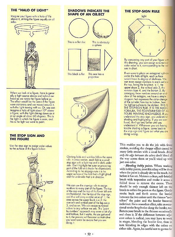
ImageClick to see full-sized image

Ah, don't take this discussion as a not-so-subtle way to persuade you to use directional lighting. That's just a little of our traditional off-topic talking, to which we're used here at this forum ;)

Ah - as for your question: if you want to go the 'traditional' way, you placed your highlights rather well. It's hard to suggest anything else, as you seem to be getting it right, unless you want to go for directional lighting - which would make it look more like this:

ImageClick to see full-sized image
-- Mahoń

Image

Back in the garage with my bullshit detector
LittleDave

Re: Dave's WIP

Post by LittleDave »

mahon wrote:Ah, don't take this discussion as a not-so-subtle way to persuade you to use directional lighting. That's just a little of our traditional off-topic talking, to which we're used here at this forum ;)
Oh, no worries. I was an art major when I was going to school, so I studied things like color theory and classical sculpture/paintings. The two methods are like comparing realism and surrealism in a way; Neither one is better, it's just different ways to go about it. It's all very interesting to me.

The problem I was having with my original question is when I thought "traditional" I was thinking mid-90's Games Workshop style which seemed very flat and boring. After seeing your examples, that doesn't seem to be the case since the red terminator you posted is amazingly eye catching. I also didn't realize the old style of painting literally highlighted every raised area, I figured there was some other method to the madness.
mahon
Super Villain
Super Villain
Posts: 23961
Joined: 31 Mar 2005, o 23:36
Location: Poznan, Poland
Contact:

Re: Dave's WIP

Post by mahon »

LittleDave wrote:Oh, no worries. I was an art major when I was going to school, so I studied things like color theory and classical sculpture/paintings. The two methods are like comparing realism and surrealism in a way; Neither one is better, it's just different ways to go about it. It's all very interesting to me.
oh, and now you're telling us? ;)
anyway - you are right.
LittleDave wrote:The problem I was having with my original question is when I thought "traditional" I was thinking mid-90's Games Workshop style which seemed very flat and boring.
you know, it's not as much about the style but about being able to press on with the chosen style. it's not the style which will make your minis eyecatching or boring. it's the execution and choices you make. you can make a great mini in the 'old' style, and a crappy one with directional lighting. That's why I chose miniatures of various qualities - I didn't want to encourage one choice over another.

That's a bit like the old discussion on painting metallics: people say metallics are easier than NMM. well, that's because they think about painting metallics as just slapping on some metallic paints, and about NMM as about the quality achieved by the best painters out there. but hey, you can paint cheap and easy NMM too. of course people say NMM looks better - yep, but only when you compare good NMM to poor metallics. when you compare poor NMM to good metallics the opinion will change. and why do people believe NMM is so difficult? if they try to achieve such good results with metallics they will notice painting with them is not that easy too. that's just a matter of what one can do with the chosen technique.

in mid-90s the miniatures were flatter than now and surely not as interesting as now. but it was the matter of choice - it's only recently that they returned to showing good paintjobs as opposed to the old choice of showing more mediocre ones (not to discourage people, and to show "you can do it, too"). but it was more because of a deliberate choice of not using the skills of painters and potential of the style to their fullest than limitations of the style...
LittleDave wrote: After seeing your examples, that doesn't seem to be the case since the red terminator you posted is amazingly eye catching. I also didn't realize the old style of painting literally highlighted every raised area, I figured there was some other method to the madness.
Exactly. The new paintjobs - and these Space Hulk models are excellent examples - show that you can do it well and achieve very eyecatching and interesting effects with this style.
That's generally the same style but done much better :)

Just use saturated colors, thin and sharp lines, bold highlights, and there you are with your eyecatching miniatures :)
-- Mahoń

Image

Back in the garage with my bullshit detector
Nameless
The Better Choice
The Better Choice
Posts: 17415
Joined: 21 Jun 2005, o 17:41
Location: Silesia, Poland
Contact:

Re: Dave's WIP

Post by Nameless »

mahon wrote:That's a bit like the old discussion on painting metallics: people say metallics are easier than NMM. well, that's because they think about painting metallics as just slapping on some metallic paints, and about NMM as about the quality achieved by the best painters out there. but hey, you can paint cheap and easy NMM too. of course people say NMM looks better - yep, but only when you compare good NMM to poor metallics. when you compare poor NMM to good metallics the opinion will change. and why do people believe NMM is so difficult? if they try to achieve such good results with metallics they will notice painting with them is not that easy too. that's just a matter of what one can do with the chosen technique.
I generally agree, but I think there's a difference when you compare poor TM with poor NMM. "Poor" is perhaps not the best word here...
Basic-level TM in my opinion looks better than basic-level NMM. So, it's easier for a beginner to achieve satisfactory effect with TM than with NMM.

Did I just drag the OT in a new direction? :mrgreen:
Nameless Painter Blog
==================================================
Image
mahon
Super Villain
Super Villain
Posts: 23961
Joined: 31 Mar 2005, o 23:36
Location: Poznan, Poland
Contact:

Re: Dave's WIP

Post by mahon »

This forum is a tangled maze of OTs :P
Those who enjoy it, stay here. Those who can't find their way, use the 'search' function... or leave ;)
-- Mahoń

Image

Back in the garage with my bullshit detector
Skrit
Needs more explanation
Posts: 10608
Joined: 9 May 2005, o 15:34
Location: The Netherlands, Breda

Re: Dave's WIP

Post by Skrit »

I'm lost but it is interesting to follow! :mrgreen:
LittleDave

Re: Dave's WIP

Post by LittleDave »

Nameless wrote:
mahon wrote:That's a bit like the old discussion on painting metallics: people say metallics are easier than NMM. well, that's because they think about painting metallics as just slapping on some metallic paints, and about NMM as about the quality achieved by the best painters out there. but hey, you can paint cheap and easy NMM too. of course people say NMM looks better - yep, but only when you compare good NMM to poor metallics. when you compare poor NMM to good metallics the opinion will change. and why do people believe NMM is so difficult? if they try to achieve such good results with metallics they will notice painting with them is not that easy too. that's just a matter of what one can do with the chosen technique.
I generally agree, but I think there's a difference when you compare poor TM with poor NMM. "Poor" is perhaps not the best word here...
Basic-level TM in my opinion looks better than basic-level NMM. So, it's easier for a beginner to achieve satisfactory effect with TM than with NMM.
I think both techniques look great if the painter is skilled in them. My only complaint is people tend to get lazy with true metallics.

The way I was taught was a single layer of silver (bolt gun metal), a black wash, then another layer of metal for highlights. That may be okay for low quality figures, but I wouldn't us it for anything else.
LittleDave

Re: Dave's WIP

Post by LittleDave »

ImageClick to see full-sized image
Quick update of what I've been up to.

The inquisitor I was working on (along with his entire retinue) wound up in the Simple Green bin after my colors chunked again. Since then I've purchased a set of Vallejos and started putting ice in the bottom of my wet pallet which seems to be working well. The Vallejos are amazing and I'm now thoroughly convinced my former paints were complete garbage.

As for the figures above, they're painted in the new color scheme I'm playing with for the retinue. I have my doubts about where this is going since the teal may be too vibrant and the colors are similar to oxidized rust (which was completely unintentional). Still very early in the process, but comments are welcome as always.

LD out~ 8)
Last edited by LittleDave on 12 Sep 2009, o 20:48, edited 1 time in total.
arctica
Too fast for the rest of us
Posts: 3257
Joined: 26 Dec 2007, o 18:33
Location: UK

Re: Dave's WIP

Post by arctica »

Actually i really like the fact you are using other colours as shading rather than the classic black/brown. I would like to see more progress so paint more ! but it's looking alright at the moment, maybe smoother transtions between the two colours but this is only a wip. What colour did you want your cloaks to be?
Nameless
The Better Choice
The Better Choice
Posts: 17415
Joined: 21 Jun 2005, o 17:41
Location: Silesia, Poland
Contact:

Re: Dave's WIP

Post by Nameless »

Actually, I can't see the pic :(
Nameless Painter Blog
==================================================
Image
Post Reply