lol
"going down Ms's Tyler ?? "
first thing first -
hilarious composicion will be hilarious no mater who paints it (i will laught iven if it would be made by Ana or Bohun - well i would iven more if they posed ther minis in a way like this )
so composicion as intresting it is it is also a "face plant" to be
if you would actualy add ther somthing on wich she could bend over - (lake , pot, treasure chest ) it could be ok - but now it is "jumping in to the abbys " or "my rack is so hevy so im gona fall"
ok end on this topic

base :
i like the idea
but as with all things it should looks real end it is actualy not about materials you used but how they interact - atm you got ther tree , covered with leafs , end a green parts end blue flowers
- end they could be together - but at this point they are separated - nothing keeps this as a 1 composicion - you need to "meld" things - so they would look like in real enviroment ( Do we got some Tutorials on basing ??? .. im sure i so some ... - will add when i rymember wich 1 it whas )
sum up -
idea good,
materials - actualy good
execusion - lacking (to improve

)
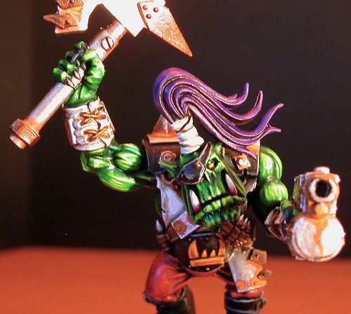
Minature :
What i like
- yellow patern on scarf - nice shaded
metalicks - gold 1 on staff (or whatever it is )
what is aceptable :
- blue it is vivid end actualy looks smouth , end iven shaded to brighter one
- flaws - a bright blue parts - dont shade blue with sepia colors = effect alvays dirty color
The bad :
Purple :
- it is third strong color after blue end green in whole composicion end is clouse to blue so they meld visualy instade separate things - bad visual effect
Skin :
somthing bad hapend with paint consystency ...
it looks granulated ,
end over all shading of skin - thats not your stronger paRT (to be improved - painting skin is actualy quite easy end enjoyable - as let you to experyment mix colors go nuts - when you get the idea how to make blue / green surface in to skin ^-^ in cauksian hue (yup thats possible - just reqire some knowlege ) - will link a tutorials
my advices :
Dark linking - it will improve work instantly - separating skin from cloaths , puple from blue end from skin end so on
- gem on the top of the staff - it is not painted

- get to know about dry pigments (this will make base cration way easer - as it is way to meld part of base together end by this geting "real" look )