Forum rules
Post pictures and discussions regarding works in progress here, please. If you have photos of these works when they're completed, feel free to post them to the right section and feel free to add the link in your post about the work in progress.
Thought I'd start one up here for the times I take a WIP shot. I've been getting more than my share of great advice from CofC, still gotta make sure i am putting it into practice... Click to see full-sized image
Click to see full-sized image
So this is the Executioner from Wyrd. It's the second time I have painted it and I really enjoy the mini. These are some quick pics taken with flash and I am a little suprised y how much is lost here in terms of contrast. The first time I painted this guys I went for goofy kinda colours but this time I wanted to try more earthy kinda realistic colours ('Cause that's important on a fat dude with steam powered claws y'know...). Anyway, I'll take whatever advice anyone feels like throwing out there. I should take some better pics too. I need to snap some of the mini I got from the ME so I should get off my ass and do it.
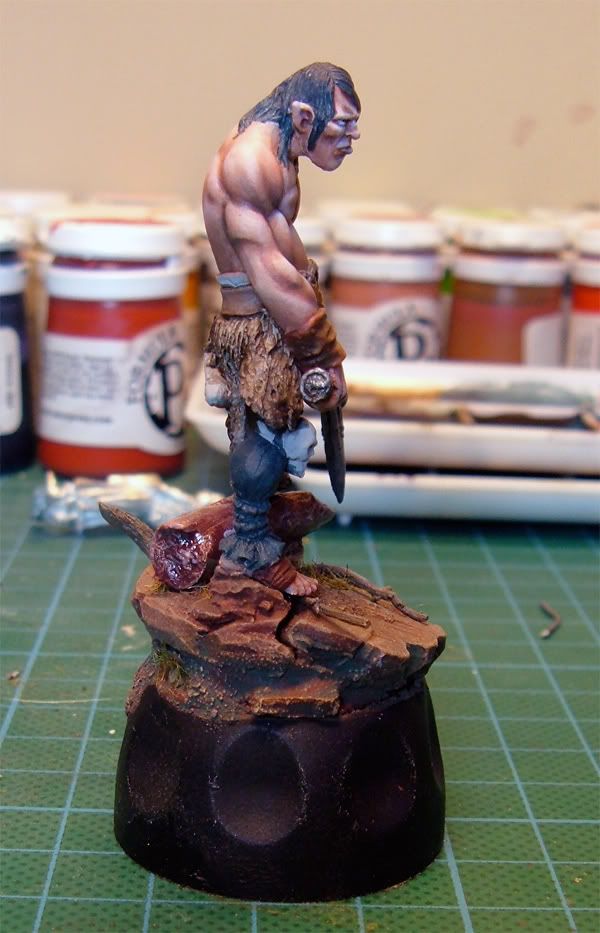
skin looks goods on the 2nd pic, especially the face! it's not as smooth at the back though.
zenithal lighting effect used for skin is not visible on pants, but I'm not sure if they are WIP or not.
brown/rusty wash for metal this engine something on his back?
claws - I'm sure that removing excess material from between them is a pain in the ass, but try... or change the pic angle to hide it
I like this a lot so far. Skin is very nice at the front. Very smooth belly and face. I would bring up the tip of the nose and the upward facing side of his lip to at least the same light colour as the lightest part of the belly. And how about adding some hair on the belly/chest?
The skin on his back is a bit more complex due to the muscles, the contrast is pretty good, but you can go deeper with your shading. Try it on the deeper parts where different muscle groups meet. Shoulders/upper arm etc...
Okay, working on this dude now. Pic's arent' great, but on this mini I really wanted to put more focus and practice on the flesh. I am trying to use the technique that Mathieu Roesche(SP?) used in his miniature mentor video of Artis the gnome as well as the tips I've been getting here. Also, one thing I am getting crit's on are my black leather boots. Seem's I just don't do them that well! These boots here would normally be called finished by myself, should I re-think that and do more? Fire away any comments you like please. Thanks again!
I like the black boots, I think black is a very hard color to paint, because I always get the highligts to strong. You did well thought! But I do have one suggestion, the boots looks to clean comparing to the blue and yellow fabrics on the mini. Maybe dirt them up a bit using the same colors that you used on the blue and yellow fabric? I think that would really make the boots look good.
Very promising start mate! I think the boots are nearly there, some sharper highlights (more towards white) here and there and as Synthet says some dusting like on the cloth and you have a winner!
good job on the dirty rags/pouches hanging from his belt and the leather parts in the front.
I quite like the boots. stronger highlights could make them look polished and shiny. I think a little weathering will make them look just fine.
 Click to see full-sized image
 Click to see full-sized image


 Click to see full-sized image
 Click to see full-sized image
 Click to see full-sized image
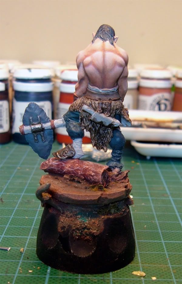